Find a street that particularly interests you – it may be local or further afield. Shoot
30 colour images and 30 black and white images in a street photography style.
In your learning log, comment on the differences between the two formats.
What difference does colour make? Which set do you prefer and why?
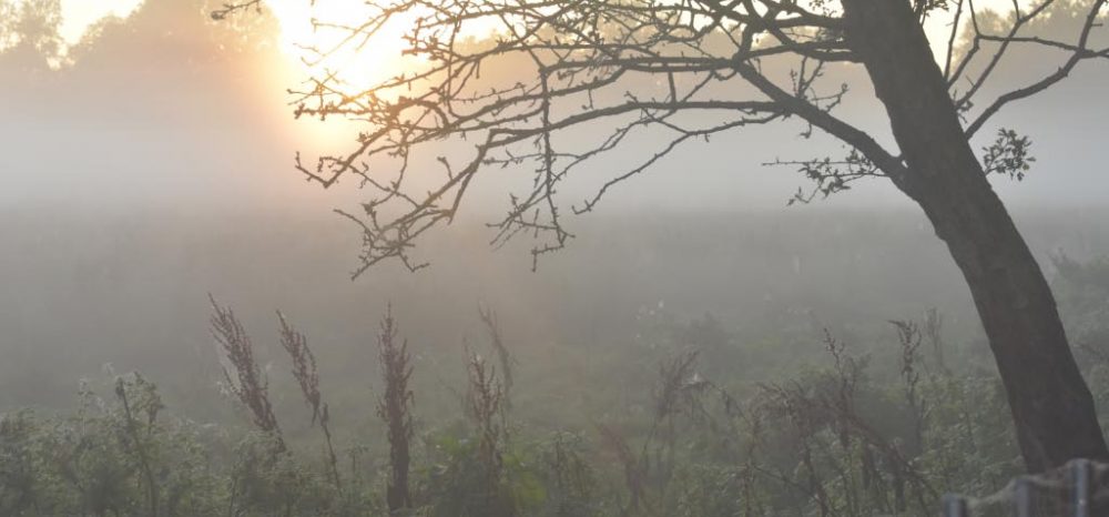
The benefits of colour
- Setting and time inferred – warm colours imply Autumn and cool colours imply Winter
- Mood – is communicated. Cool implies sadness and lonliness and warm implies tenderness and joy
- Emphasise relationships – same colours join subject matter and emphasise relationships – analogous colours
Black and White
- Era – choice of B&W or colour suggests an era – B&W is more timeless
- Light and shadows – are accentuated, dramatic shadows brought to attention
- Wide range of tonal values – if very black to white and greys in image to start with
Make sure you shoot in RAW so you have the choice of colour or B&W – if you only shoot in JPEG and choose the B&W setting the colour information won’t be captured and stored
Most importantly – make sure you know WHY you chose colour rather than B&W
Convert images to black and white when the light, form, or texture in the scene is more compelling than the hues of the subject matter. Black and white is a good choice when the color in a photo serves only as a distraction from the message you want the image to convey.
Notes On Work Produced
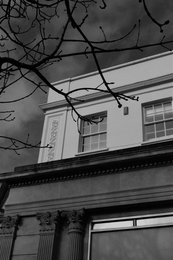
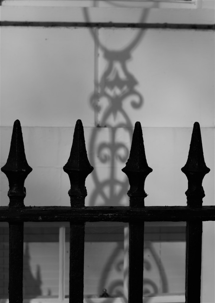
The B&W images taken concentrated on light and form. I really like the ornate ironwork on the Regency buildings in Cheltenham and on a bright day the striking shadows create extra ornate patterns that just improve the look of the building and enhance the existing aesthetics.
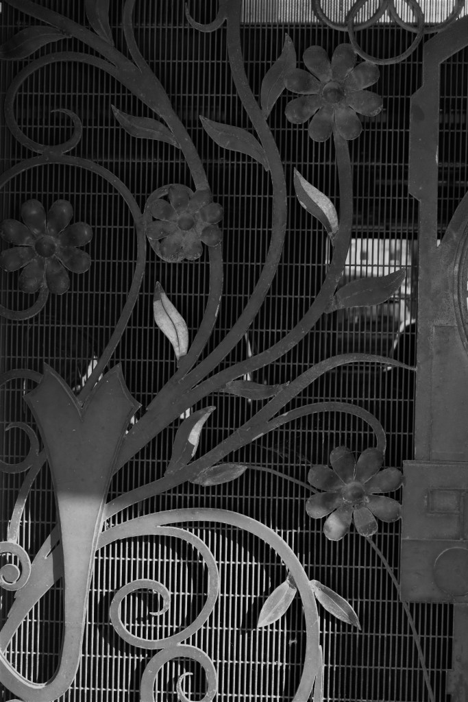
The simpler the image, the better B&W works, large striking geometric shapes stand out more if shot this way.
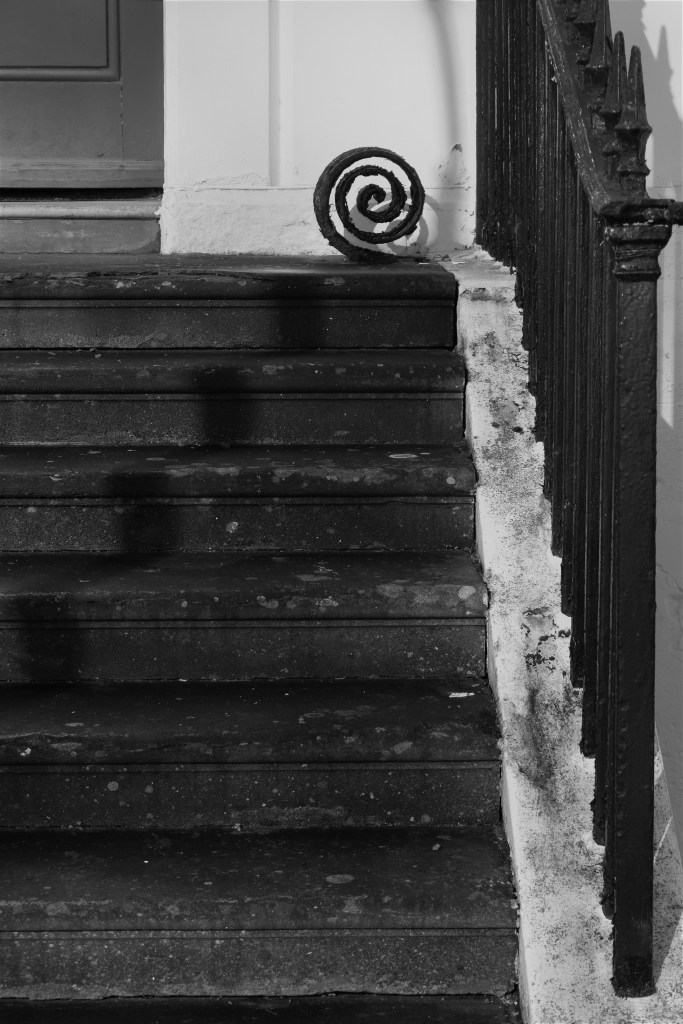
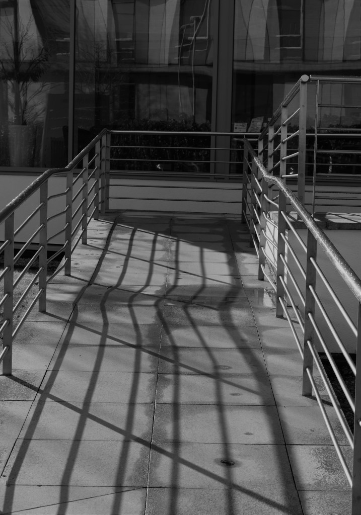
The form of the curly wrought iron structure catches the eye, as well as the shadow cast behind it. The simplicity of the stairs make the structure stand out further. I like how the rough white line on the right hand side draws the eye to the structure at the top.
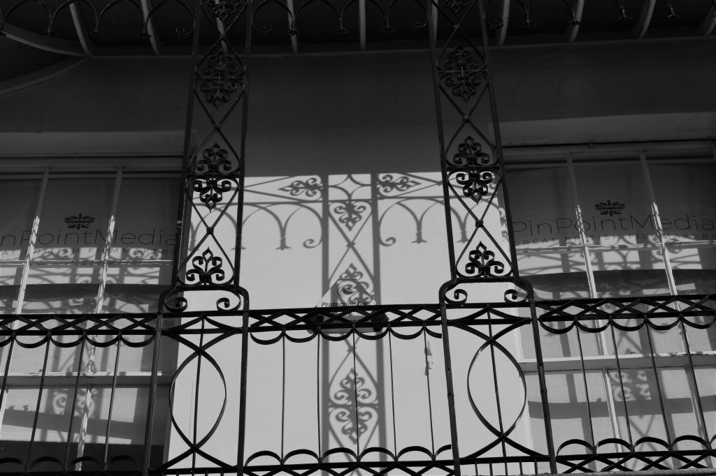
Light and form at play again in this image – I love how the shadows enhance the ironwork further


Bibliography
Cameras, D. and Guide, B., 2020. Color Vs Black And White Photography – What Makes Sense And When?. [online] Photographyvox.com. Available at: <http://www.photographyvox.com/a/color-vs-black-and-white-photography/> [Accessed 9 March 2020]
