Find a street that particularly interests you – it may be local or further afield. Shoot 30 colour images and 30 black and white images in a street photography style. In your learning log, comment on the differences between the two formats. What difference does colour make? Which set do you prefer and why?
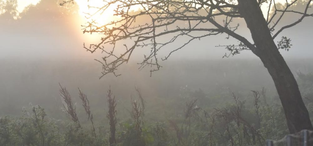
The benefits of colour
Setting and time inferred – warm colours imply Autumn and cool colours imply Winter
Mood – is communicated. Cool implies sadness and lonliness and warm implies tenderness and joy
Emphasise relationships – same colours join subject matter and emphasise relationships – analogous colours
Black and White
Era – choice of B&W or colour suggests an era – B&W is more timeless
Light and shadows – are accentuated, dramatic shadows brought to attention
Wide range of tonal values – if very black to white and greys in image to start with
Make sure you shoot in RAW so you have the choice of colour or B&W – if you only shoot in JPEG and choose the B&W setting the colour information won’t be captured and stored
Most importantly – make sure you know WHY you chose colour rather than B&W
Convert images to black and white when the light, form, or texture in the scene is more compelling than the hues of the subject matter. Black and white is a good choice when the color in a photo serves only as a distraction from the message you want the image to convey.
Notes On Work Produced
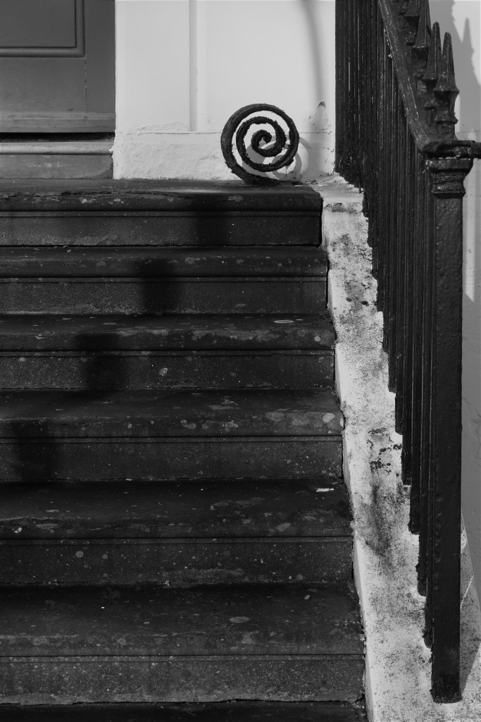
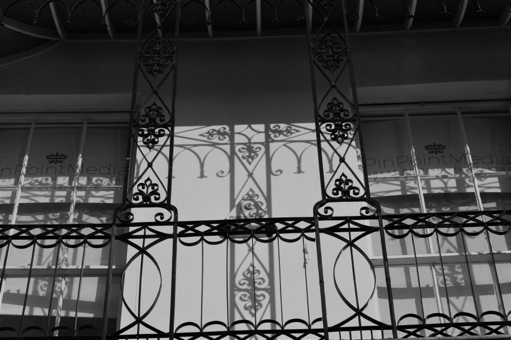
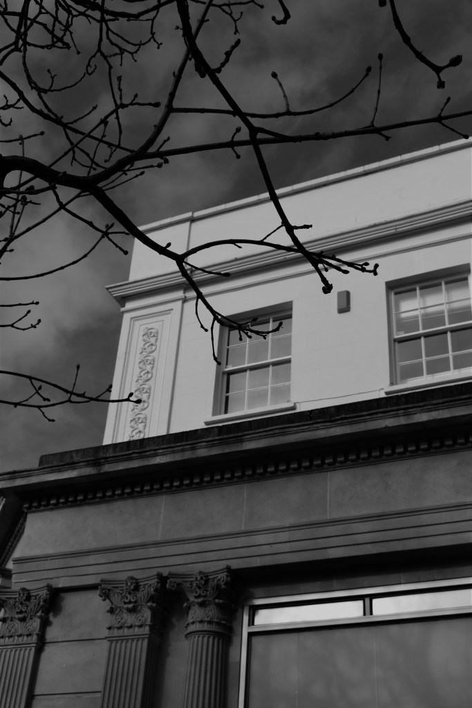
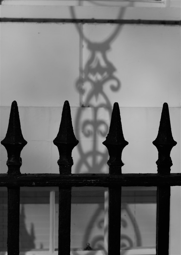
The B&W images taken concentrated on light and form. I really like the ornate ironwork on the Regency buildings in Cheltenham and on a bright day the striking shadows create extra ornate patterns that just improve the look of the building and enhance the existing aesthetics.
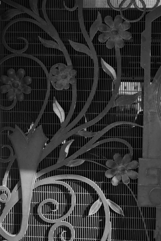
The simpler the image, the better B&W works, large striking geometric shapes stand out more if shot this way.
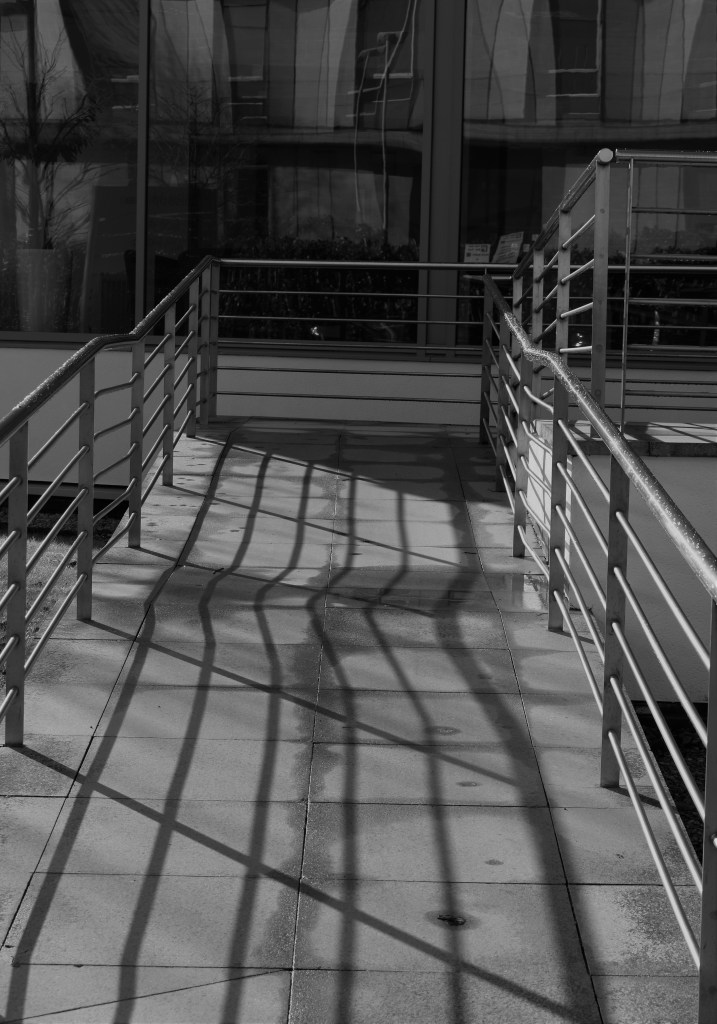
The form of the curly wrought iron structure catches the eye, as well as the shadow cast behind it. The simplicity of the stairs make the structure stand out further. I like how the rough white line on the right hand side draws the eye to the structure at the top.
Light and form at play again in this image – I love how the shadows enhance the ironwork further
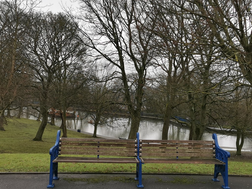
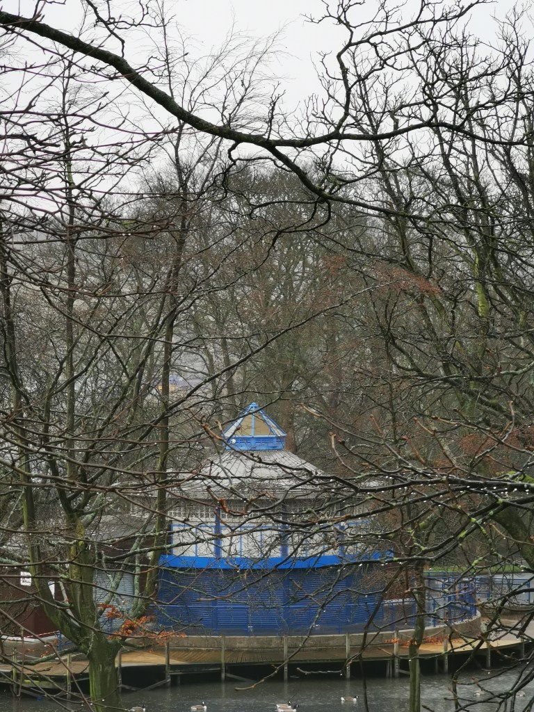
Large, simple geometric shapes lend themselves to B&W, I have tried to keep this simple by only including selected elements in the frame so it’s not too busyPlaying with form and light again helps to create interest Close up shapes and patterns that are interesting are emphasised further when in B&W – the light falling on the lower third of the image adds interest and draws the eye to this area as a focal point The shadows have become the main subject of the image – using light and form works with B&W photography Bradford Industrial landscape lends itself well to B&W. The steam cloud on a grey day looks more dramatic. The geometric buildings show their form better in B&W. The colour blue connects these images nicely. On a dreary winters day where the park displays dull colouring, making a contrasting colour the subject adds interestThe blue contrasts with other man made features too. There are no other strong competing colours so this works effectivelyBright blue on a dull day in winter adds interest and beauty
This assignment is designed to give your tutor a feel for your work and won’t count towards your final grade if you decide to have your work assessed. However, the assessors may wish to see it so that they can gauge your progress across the course. Create at least two sets of photographs telling different versions of the same story. The aim of the assignment is to help you explore the convincing nature of documentary, even though what the viewer thinks they see may not in fact be true. Try to make both sets equally convincing so that it’s impossible to tell which version of the images is ‘true’. It might be interesting to consider the project as evidence for a court case. What conflicting stories can you make your images convincingly tell? Would it stand up in court? Choose a theme and aim for 5–7 images for each set, depending on your idea. Discuss this with your tutor. Here are a few ideas: • You could interpret this brief by showing the same scenario from two different angles. Does this alter how we read the situation? • You may wish to create an alter ego by using snapshots of yourself or a friend. This could involve photographing them in two very different and potentially conflicting personas. • You could make a parody of a dating website profile picture. Create different versions of the same person looking completely different in each one. Which one represents them best and how can we know? Or you may prefer to use your own take on the theme. However you choose to interpret the brief, ensure the images are candid and ‘taken from real life’. Be experimental and take some risks. Perhaps you could make a list of ideas and choose the most challenging or absurd option to stretch yourself. Send your sets of images to your tutor by the method you’ve agreed. Include an introduction of 300 words outlining what you set out to do and how you went about it. Also send to your tutor the relevant pages of your learning log or your blog url. It’s good to get in the habit of printing your work so try to send prints to your tutor where possible. This is not obligatory but will help when it comes to assessment. Developing your prints in order to achieve the best results is a long process so it’s best to start now.
Initial Response To The Brief
Having studied the first unit and now understand the differences between witness photography, reportage, documentary photography and Art photography and realising that an image is not necessarily the truth but depends on the context and also how the viewer sees and interprets the image. The idea of introducing different subjects, composition and several other factors to create two different versions of the same story is exciting in a conceptual way but also creatively in the form of art photography. Two sides of the story or different vesions, selective editing can create different versions of the truth. This takes place around us all the time but I have never considered it until now. Social media photography is a perfect example of this concept, where by the power of selection, only the best photos are taken and then chosen to be displayed, giving a very false impression of the reality of the life of an individual.
Planning
Time management is always the challenge. I knew I would have to go out two or three times to take enough shots for this assignment. Street photography like this also has an element of chance and uncertainty since we are dealing with a live dynamic situation. Each time I visit an area to shoot could result in very different results, and possibly nothing at all. Unfortunately the issue of homelessness is never far from us so shooting opportunities will certainly be available.
Research/Inspiration
After an initial discussion with my tutor about my interest in social documentary and I mentioned I was inspired by the work of Anthony Luvera after hearing him speak at the Photography Symposioum at Birmingham City University last year in October. Anthony worked worked with the homeless and has helped highlight their plight and has even changed laws around safeguarding of the vulnerable through photography. Julian Germain was suggested by my tutor as an approach to this assignment, I was also lucky enough to hear him speak about his project in the Brazilian Favelas. The work was called “No Olho da Rua – In the eye of the street – He gave disposable film cameras to mostly the children of the favelas and asked them to take the photographs, this is a great example of “two sides of the story” since the subject becomes the author and the images are by nature totally different.
Idea
I had ideas about taking photographs of a town where the derelict areas are photographed and the second set where photos of the same town but only the nice parts are taken. Also an idea of photographing a road that is being repaired, one set just the road in a bad state of repair but leave the diggers and other related objects out of the photo, then a second set with all the construction activity, by omitting vital elements in one set it would tell a totally different story. Social media is a great one to use as an example too. There was also an idea to photograph less stereotypical things on my recent skiing holiday to Norway, for example, our very messy bedroom, the very wet gloves all competing for space on the dryer in our cabin and others, the car stuck in the snow etc.
Conclusion
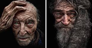
I enjoyed preparing for this assignment and I am interested in social documentary and in particular the people who are vulnerable, on the margins of society who are in need of help and support. Choosing the homeless is in line with the photographers I am drawn to like Julian Germain, Anthony Luvera and also Lee Jeffries.
This assignment is designed to give your tutor a feel for your work and won’t count towards your final grade if you decide to have your work assessed. However, the assessors may wish to see it so that they can gauge your progress across the course. Create at least two sets of photographs telling different versions of the same story. The aim of the assignment is to help you explore the convincing nature of documentary, even though what the viewer thinks they see may not in fact be true. Try to make both sets equally convincing so that it’s impossible to tell which version of the images is ‘true’. It might be interesting to consider the project as evidence for a court case. What conflicting stories can you make your images convincingly tell? Would it stand up in court? Choose a theme and aim for 5–7 images for each set, depending on your idea. Discuss this with your tutor.
Send your sets of images to your tutor by the method you’ve agreed. Include an introduction of 300 words outlining what you set out to do and how you went about it. Also send to your tutor the relevant pages of your learning log or your blog url. It’s good to get in the habit of printing your work so try to send prints to your tutor where possible. This is not obligatory but will help when it comes to assessment. Developing your prints in order to achieve the best results is a long process so it’s best to start now.
Two Sides Of the Story
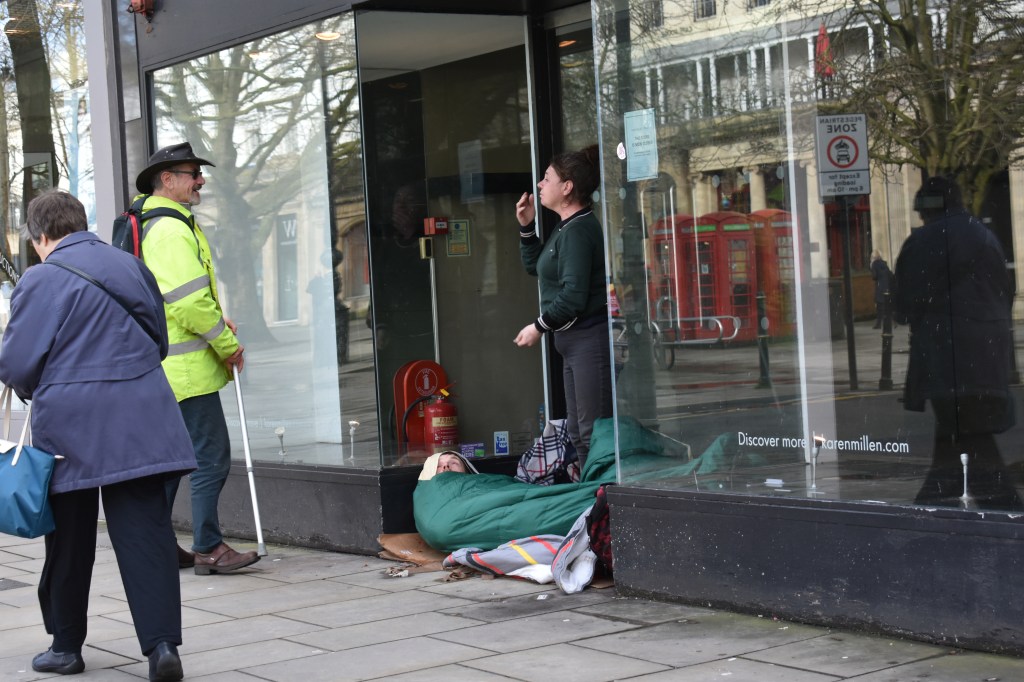
Documentary photographs can contain different versions of reality, depending on the thought process, the narrative the photographer has in mind and what outcome or objective the work aims to achieve. The two sets of images I have made are inspired from the introductory discussion with my tutor about my interest in social documentary photography. We both have had experiences around the work of Julian Germain, I have attended a talk where he presented his work on the lives of the people in Favelas in Brazil called “No Mundo Maravilhoso do Futebol 1995 – 2002”. Julian Germain gave instant film cameras to the people who lived in the favelas and asked them to take photographs for him, the images produced were the “other side of the story” and therefore less stereotypical images and often less than perfect exposure, however,this added to the narrative.
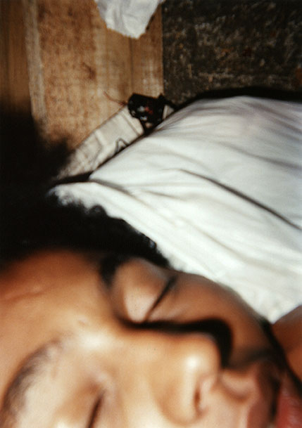
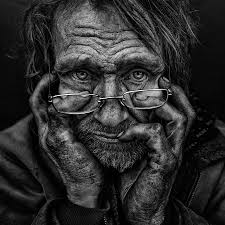
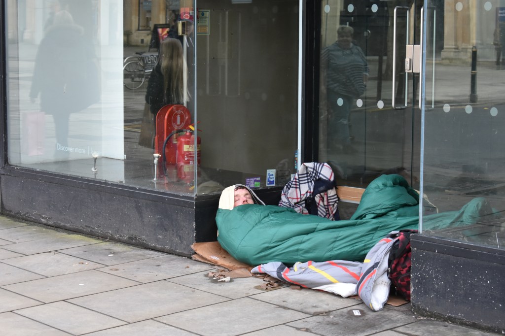
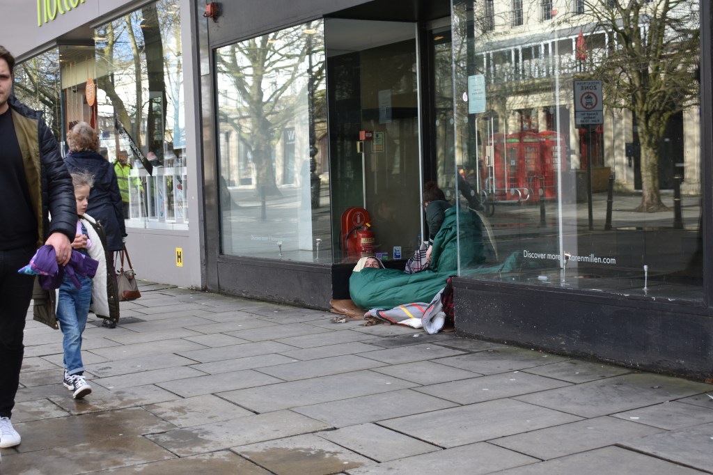
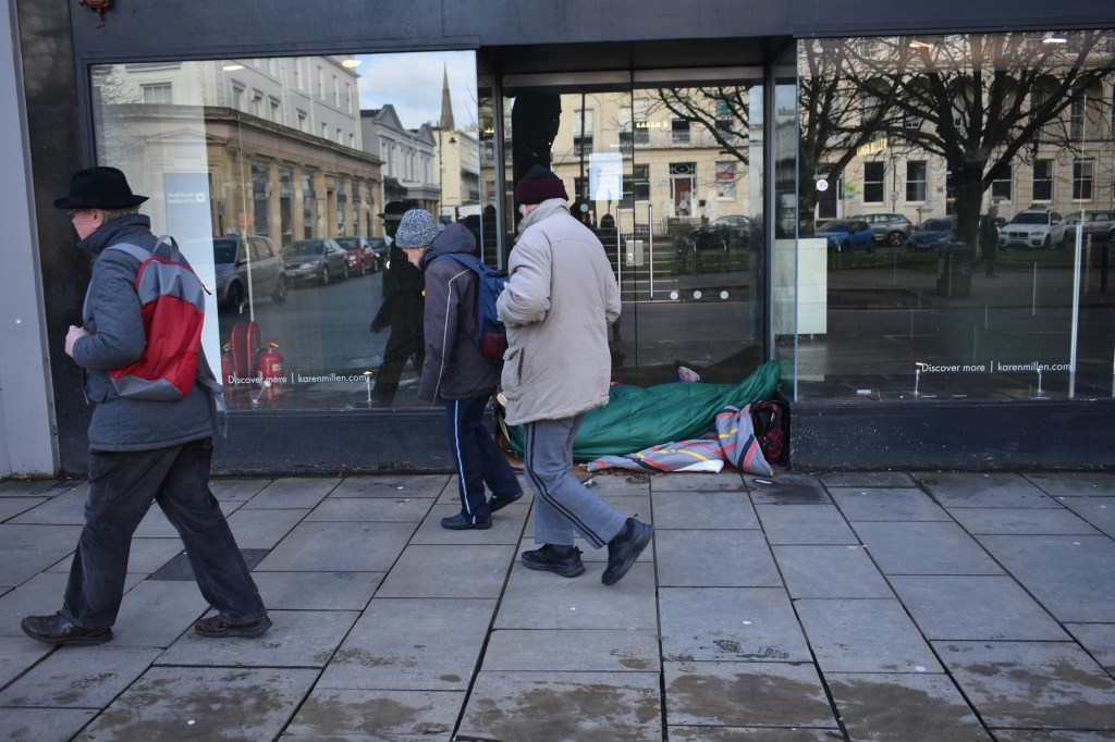
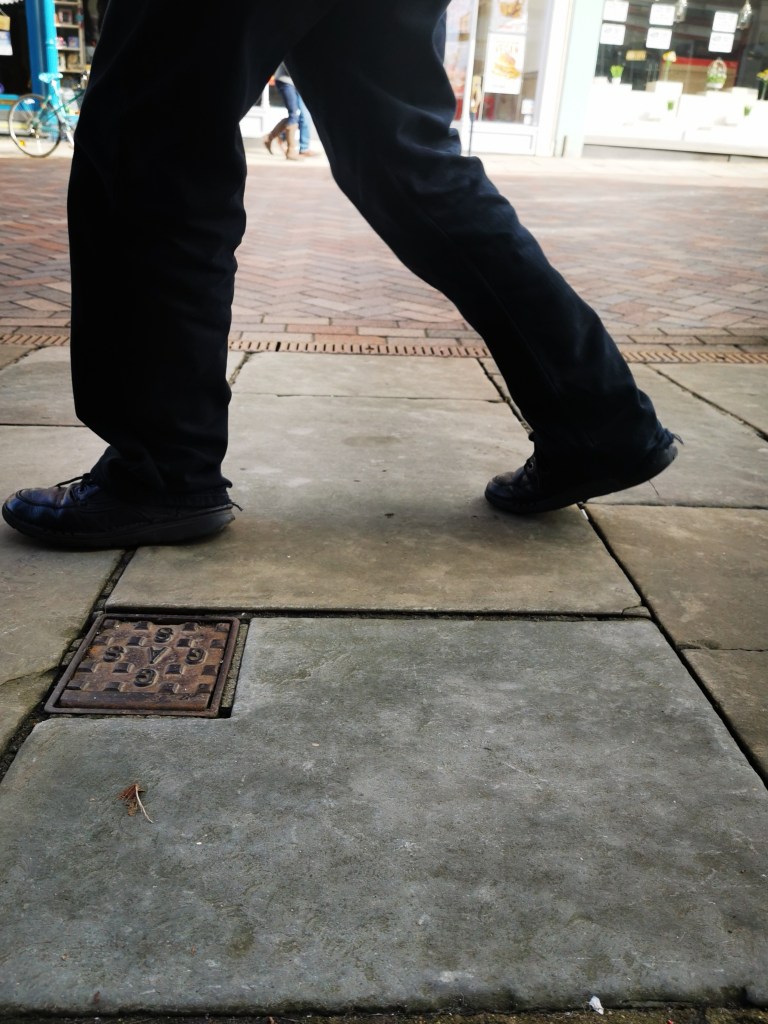
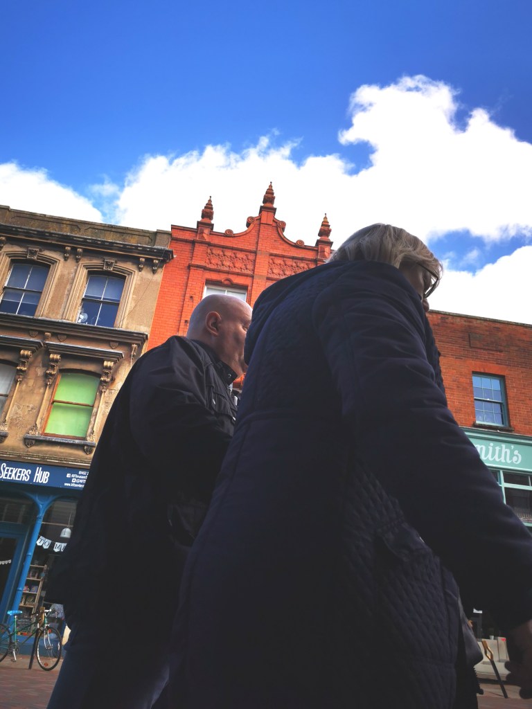
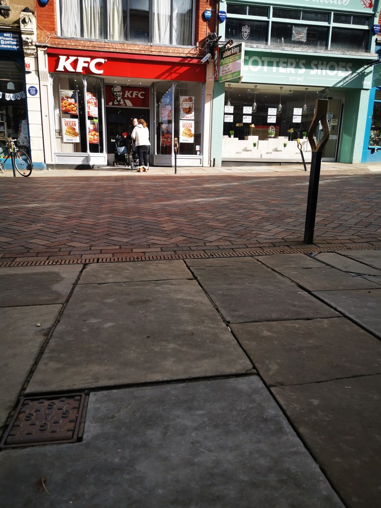
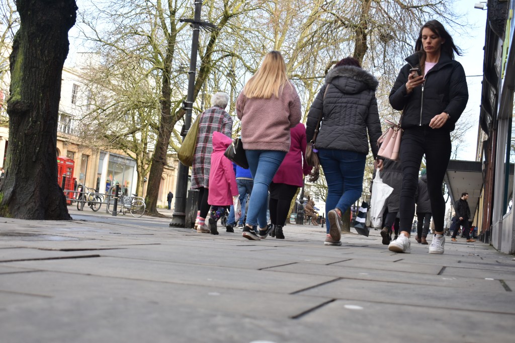
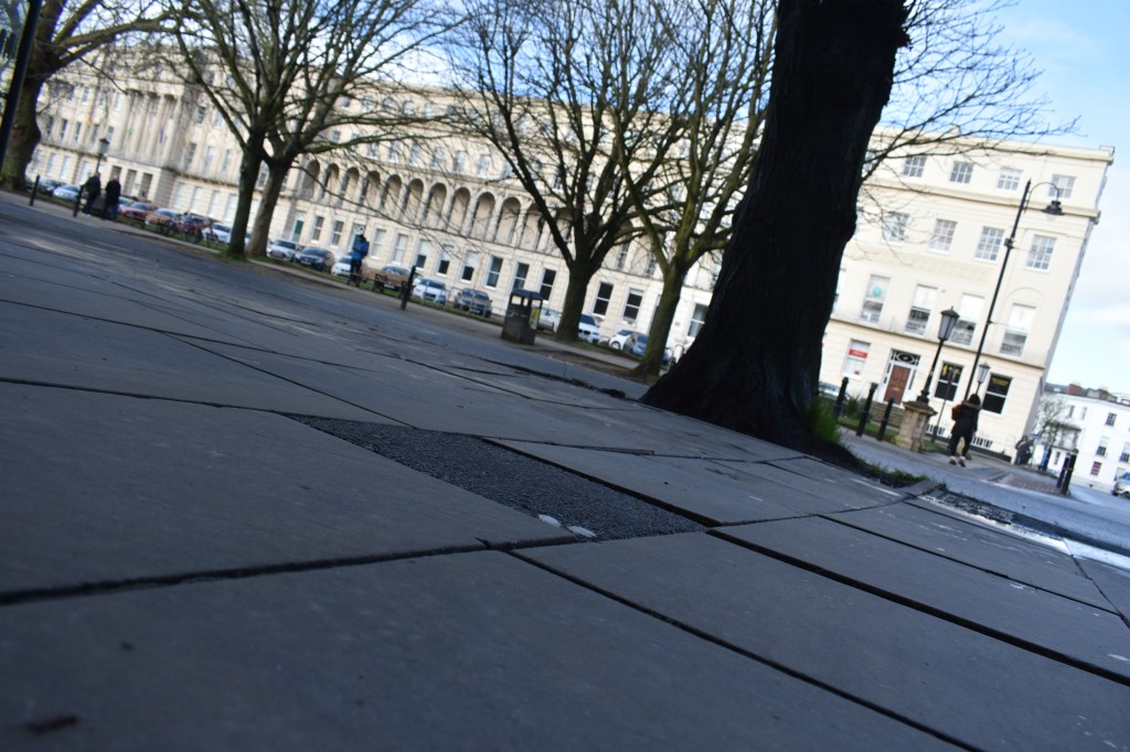
I have made work showing how the public view the homeless on the street, the photographs are taken from the view point of a passer by on the street. The second set of images is from a the perspective of the homeless person, taken lower down with what they would see from a sitting or lying position. The images differ in colours, the public view are more colourful and more subjects are included in the image, a more positive, ordinary feel to these images. The set “The View From The Other Side” shows more concrete pavement and people from a completely different point of view, hardly every seeing people’s faces as they look away or avoid eye contact.
Image 0832a is one that stands out for me because of the interaction between both sides, the look of hope on the man’s face who is in his sleeping bag is one of desperation and hope which I find very sad. This is a common image seen on the streets of Britain, I do prefer the set of images taken from the perspective of the homeless individual,these leave the viewer to find a meaning beyond the initial visual.
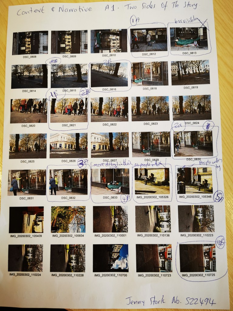
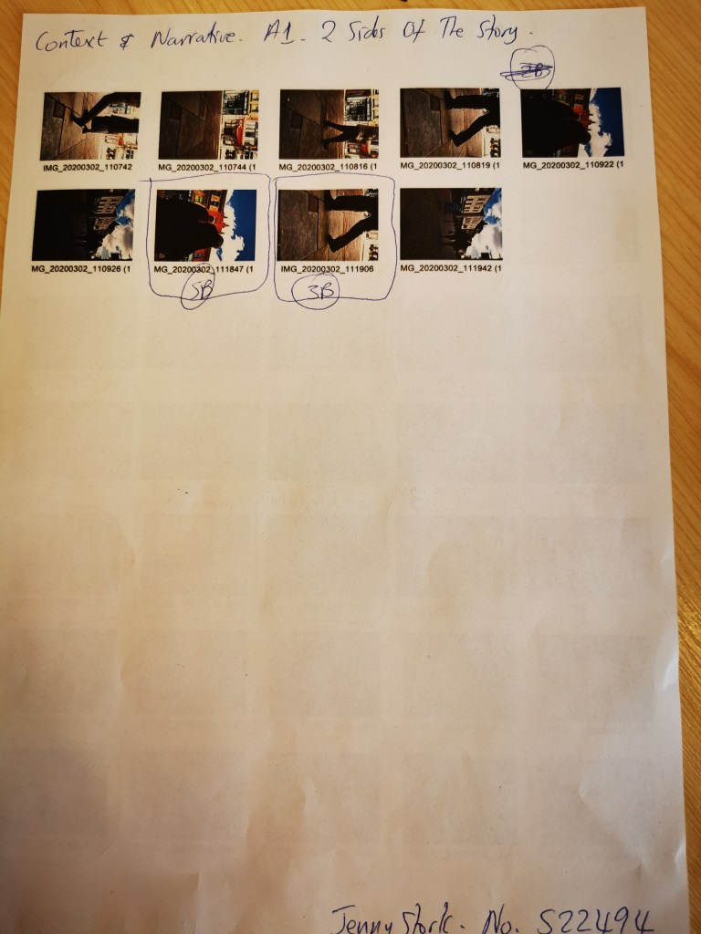
Annotated Contact Sheets show my thought process for selection of the images
The images with the letter A next to them are from the public point of view – the ones with the letter B are from the viewpoint of the homeless person – the other side of the story The images with the letter A next to them are from the public point of view – the ones with the letter B are from the viewpoint of the homeless person – the other side of the story