There will always be a time when you have to write about your work, either an artists statement or explaining your work etc Or someone asks what do you do
Critiques are subjective, they come from our won history and opinions – but can make it constructive and objective – need to go beyond whether like or dislike an image
Just talk about the photo right in front of you – don’t go off piste
Is there a caption or artist statement? – this can really change the context of the image – any other elements that go along with it that tells a story
Can we get the intention? – only if photographer there or a written statement for context
From a visual design perspective it’s good to create a hierarchy in your image, the main subject is the star of the show, then other layers or objects in the background or foreground – the supporting cast – they are there to support the main subject. If the viewer dosent know what the subject is then there is something wrong with it and needs changing.
How many times to do you ask when you are shooting “what is my subject?” I need to shoot so the subject is the main star of the show – get specific about why you are making the image then you can make technical/. visual decisions to highlight what the subject is. Everything in the frame should support the subject – whatever detracts should be removed or minimised
The key is to be discerning once you have taken the images to decide which ones to show – based on a set of criteria – there is no right or wrong but these are guidelines
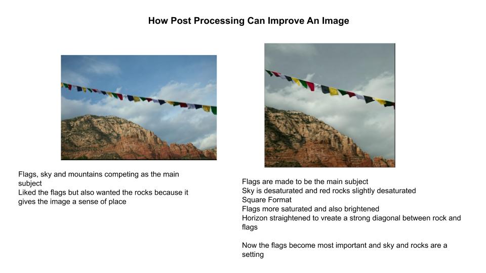
Post processing – support the subject – cropping, desaturating, lighten dark areas.
Blue skies and green grass are very alluring, so if these aren’t your main subject then often de saturate in post processing so they take more of a supporting role to the main subject in the image
Perspective – get down on his level and make him the main subject ( dog photo)
Catch light in the eyes when shooting living figures
Take film and process it in the wrong colours – this is an old fashioned way of adding filters and post processing – the human element is at the edge of the frame which creates tension and movement – also then, it’s not the main subject if there is something else in the image that is
Process with a bluish/greenish cast – this portrays emptiness and changes the mood and feel of the photo – critiques are subjective so not eveyone may get this
Una Barthes shoots alot of images that are totally out of focus – context matters more with this type of image – if you are going to break a technical rule – do it properly so It dosent look like an error. If out of focus can still talk about shape and colour
Irving Penn was the opposite and got every detail close up
There is a rule that you shouldnt put the horizon in the middle of the photo – should be in the upper or lower third to create more visual interest. If the horizon is off kilter, really make it this way so it looks intentional
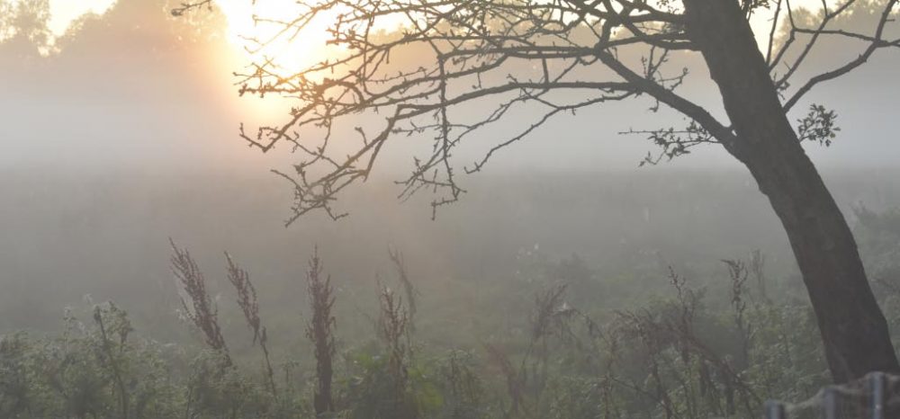
Apple about to drop – growth in a desolate area – last one on the tree still hanging on – feel of isolation, hanging on , security
The subject as an apple is not the most important part of the image to talk about but the symbol or metaphor is what is important here
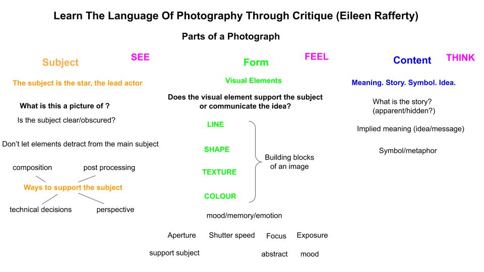
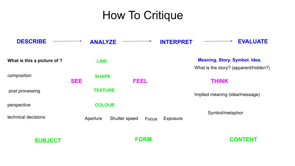
In order to critique an image (or for any artwork), the academic approach to this Is :
In photography, probably more than any other artistic discipline we drop the ball the most on presentation. We need to think more about the final outcome, printed? Digital ebook, photobook? This matters alot as to how the viewer experiences, interprets, thinks about your work.
Is what you are seeing and feeling helping to support the idea, story, message? (THINK)
If you are seeing and feeling something completely different to what the photographer intended – then you need to think about what changes can you make to bring us closer to what you are trying to communicate?
Photos in a series, diptychs or triptychs:
Need to be talked about together, colours play off eachother, textures prominent, natural elements (water and wood) – both about flow (nature) one and many, quality of light the same across all (temperature, direction, quality, hard/soft)
When you eliminate colour, line, shape and texture need to be important and prominent.
Need to talk about what hits you first and how it makes you feel – what else in the image may be contributing or causing that reaction?
Technique – does it add to it or get in the way? HDR and soft focus
The collage technique used by David Hockney is something that is prominent and needs to be talked about
Sometimes the filter is too strong and can obscure the form or the content
Symbols – loaded with symbolism – face of Putin
Text is very prominent – when it is on an image we read it immediately – very powerful visually – it always has to be addressed and is really meant to communicate something
Jim Goldberg made work where the subject in the image wrote captions about their own image rather than the photographer doing this.
With conceptual images it is more important to have a context with these
It is still possible to talk about abstract photos – form and colour are most obvious – talk about line, shape, colour, texture and technical choices made to produce the image
In a series, shot in the same location or different? Visually connected by colour, texture, scale – think about why these have been put together?
or put together based on a concept – a mood or idea is the same
Could put some context to the series through an artist statement, titles, captions
Youtube video can be found here
