Exhibition: Nalini: Arpita Shah : 15th Feb 2020: Bradford

Yesterday I visited Impressions Gallery in Bradford to see an exhibition I had heard a great deal about and had a particular interest in for 2 reasons:

1) Arpitah Shah was my tutor for “Expressing Your Vision” and

2) I have a personal connection to this work that focuses on migration, distance and loss. I moved from Africa where I lived till the age of 21 and moved to the UK, dealing with cultural differences and still visiting and talking to family who have remained in Africa.

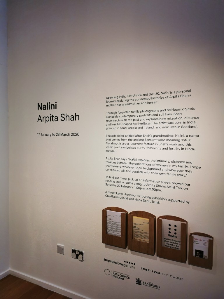
The exhibition is named after Shah’s grandmother, Nalini, a name that comes from the ancient Sanskrit word meaning “lotus” which symbolises purity, femininity and fertility in Hindu culture.

This exhibition has been four years in the making and I love how Arpita has combined so many elements to make exhibition a rich experience for the viewer, some of the ways she has done this :

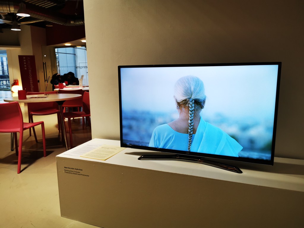
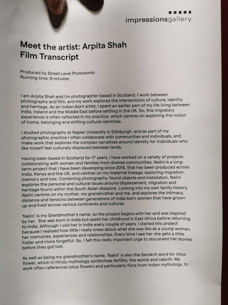
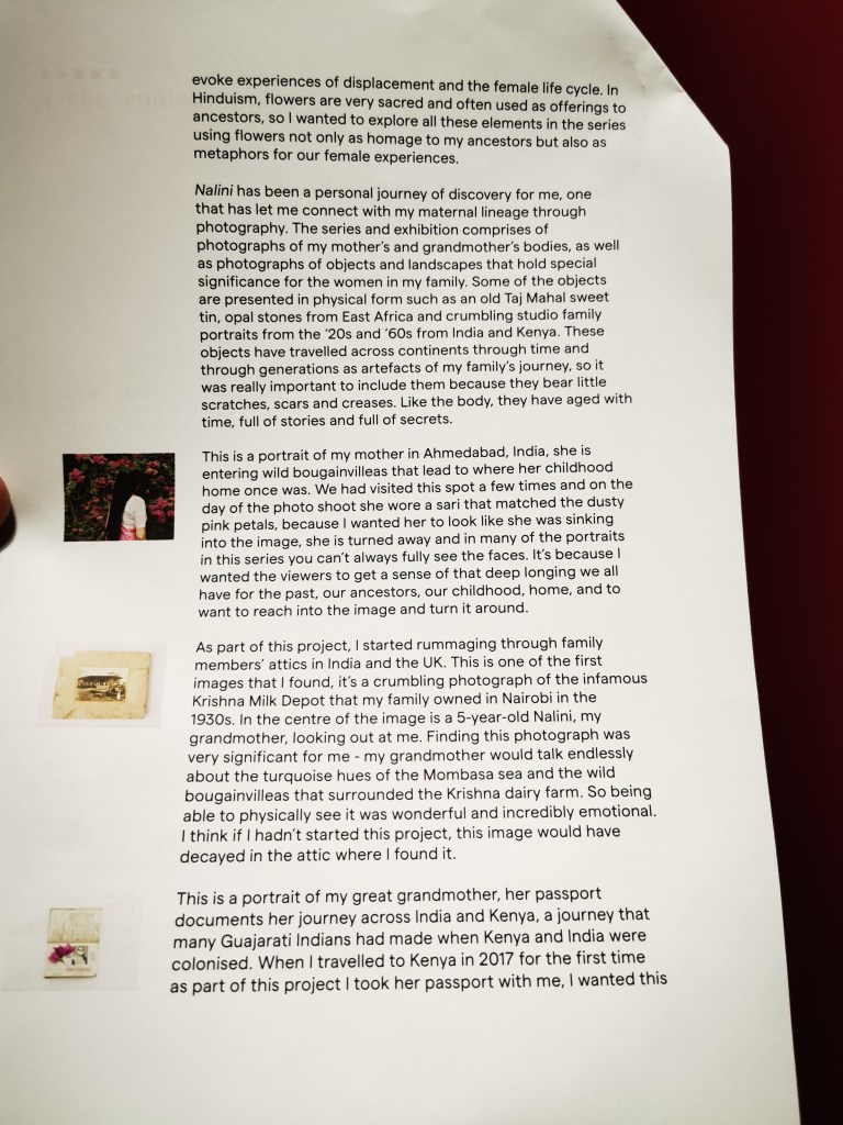
The video at the entrance gives a very good overview of the meaning behind the images she is exhibiting without reading about it, there is also a script of the video which is useful.

The explanatory video at the entrance to the exhibition is really useful to give the visitor a good idea of the thought behind each image and an explanation of the work

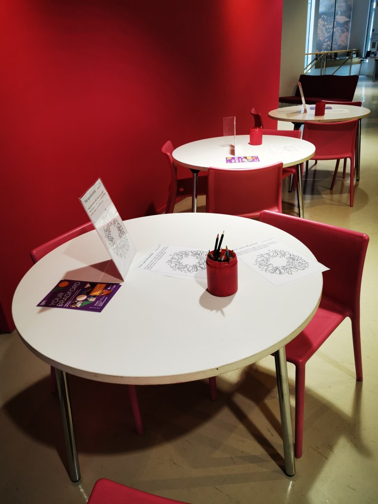
There is a children’s area where some of the images have been recreated into images that can be coloured in

The children’s area is a great idea, they can learn about art and heritage while the parents can view the exhibition, a double benefit, win win situation!
One of a number of colouring choices for the children

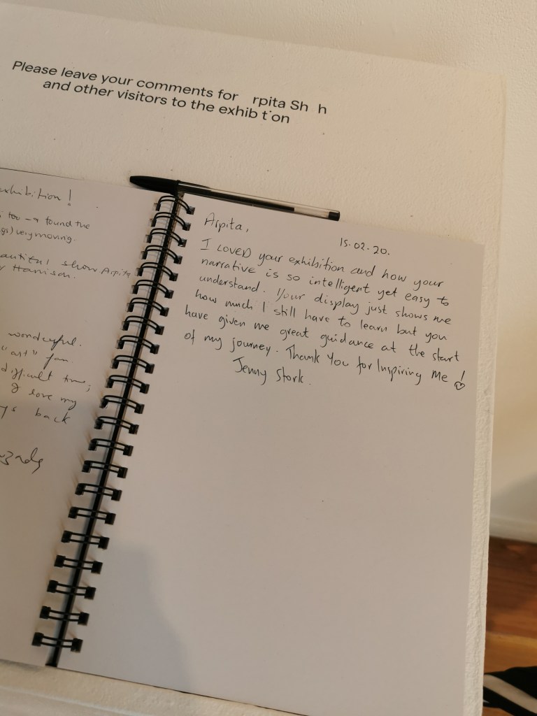
There is a comments book for visitors

The comments book is something I enjoyed at the exhibition and haven’t seen it before at any others I have been to, being new to photography I am not sure if this sort of thing is common ?

There are options for large print and braille

I really like the thought behind the large print and braille versions of informaiton

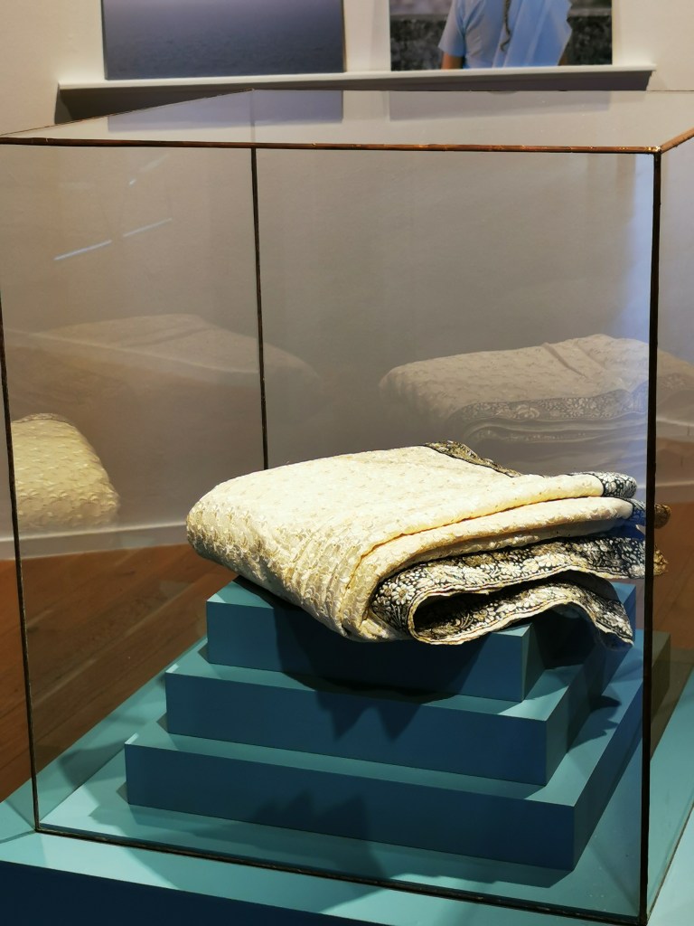
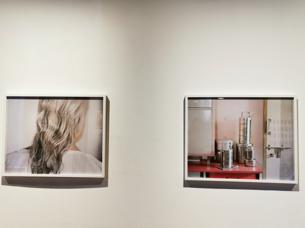
The sari that is almost 200 years old is on display, as well as an old suitcase used to move from India to Kenya, and a display case full of several artefacts that related to the images

This almost 200 year old sari is a wonderful example of connection, tradition and bonds. I think this display should have been next to the old image of Arpita’s grandmother who was wearing it so the connections can be more easily made

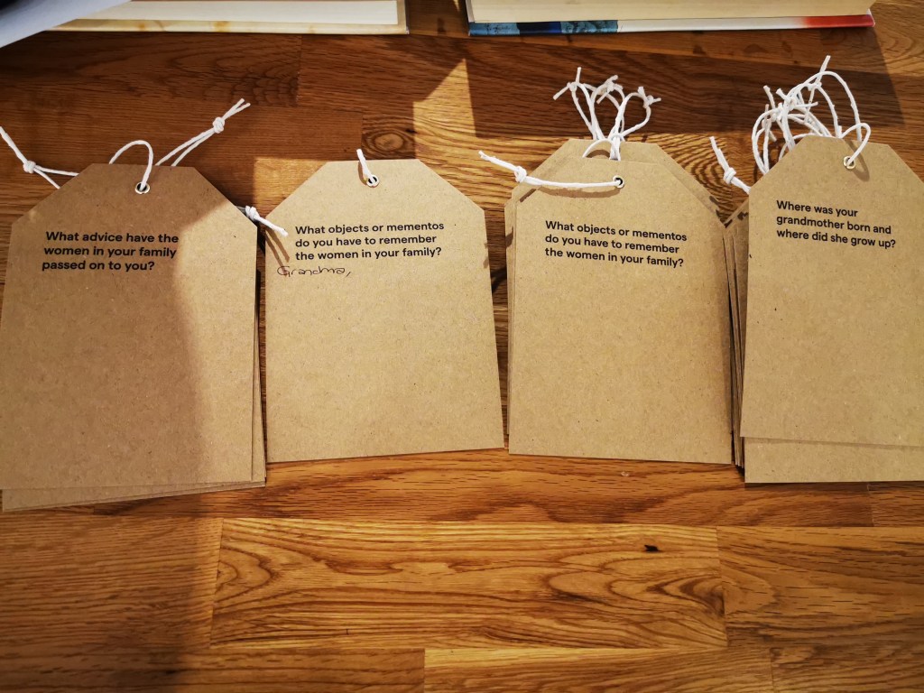
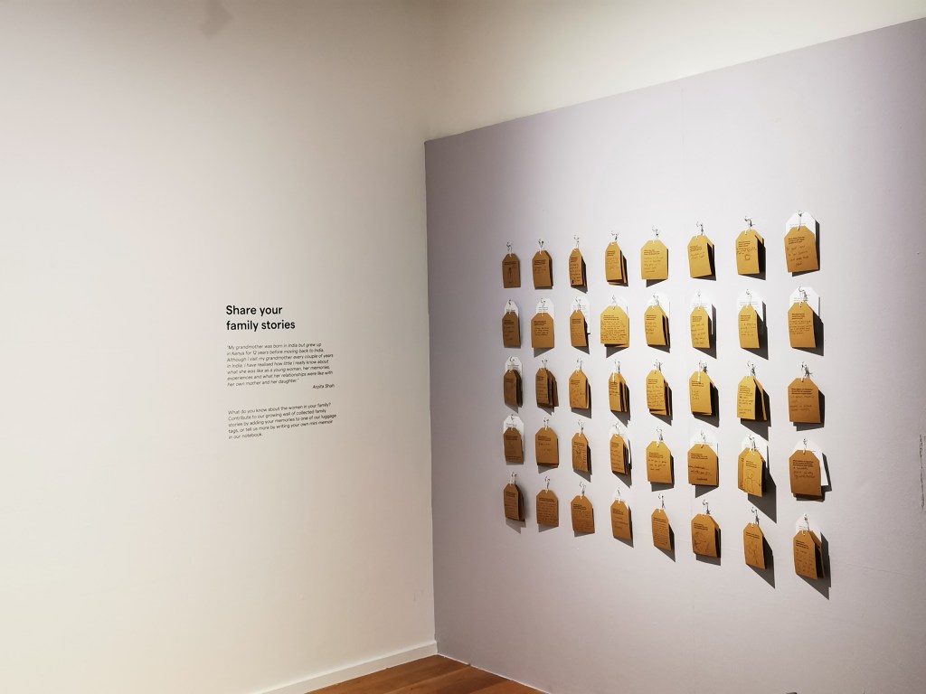
Four different cards for visitors to write about their own mother or grandmother and these are hung up on a wall


Another great idea to add richness to the experience of the visitor
I think these cards are going to be used to create more work, I will have to make a note to find out what happens to these

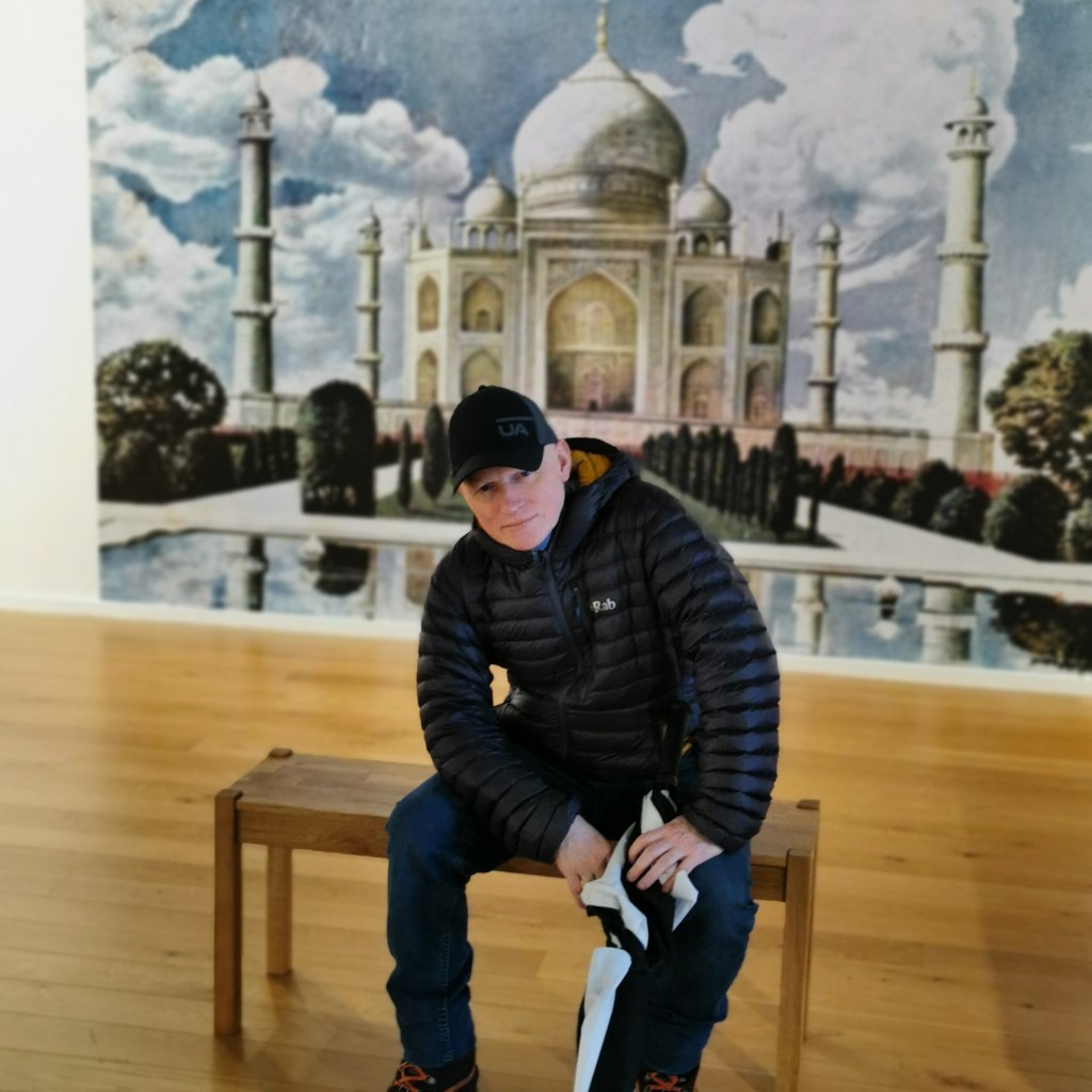
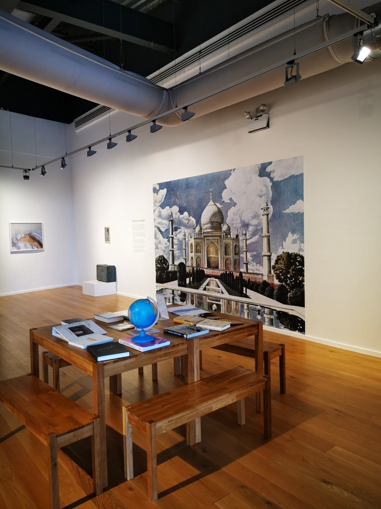
My favourite example of this is the large image of the Taj Mahal that she reproduced from an old tin the family have had for several generations, this is where people are encouraged to have their photograph taken.

The selfie wall, I think the exhibition details and Instagram info could be put on the image so the awareness is increased on social media
Books relating to the subject of migration and families are there for visitors too. This is a great idea and if I had more time I would have loved to read these

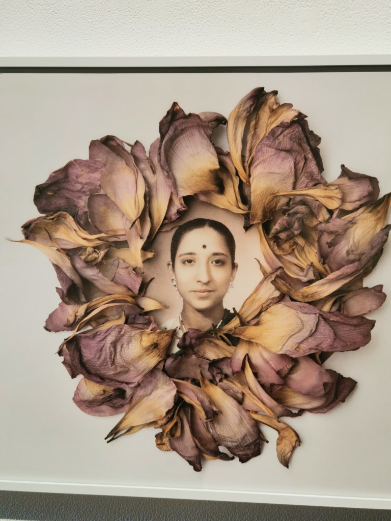
One of my favourite images is the one with the dried lotus flowers around a printed image

Hand tinted image of Nalini and the lotus flower petals surrounding the portrait

My challenge is narrative in my work and this module will hopefully improve my skills. This work in my view is an excellent example of narrative, the story is told very well and the images tell a story that has deep meaning, several layers of meaning which is intelligent.

The visual connections between images is very well done too, something I also need to work on and improve.

The visual connection between the silver hair and the kitchen equipment was something I particularly liked.

Conclusion

The exhibition was yet another valuable learning experience for me and shows how much I still have to learn. I realise this exhibition took years to create and a team of people to work on the editing and creating everything I saw here, with this in mind I can’t be too hard on myself when I produce work for assignments. Editing work and choosing images that visually connect as well as the narrative is something I can learn from Arpita’s work. I realise the reasoning why the artist didn’t include any work that showed the face of her mother and grandmother, but for me it would have been nice to see an image of the three generations together to demonstrate the bond they have. With so much work put into developing the narrative, we would have bought a book about the exhibition, this is something I would have done and sold signed editions of a photobook to make more money out of it. This was one of the things my partner and I discussed, how to monetize this work? A photobook would be one way certainly, not sure about further ways or how the artist benefits financially from this work?

South West Student Group Study Day With Stephen Monger, 8th Feb 2020

Stephen Monger is a tutor and teaches at UWE – he is the programme leader for the MA – Graphic Arts programme and the BA(Hons) Graphic design https://people.uwe.ac.uk/Person/StephenMongerhttps://people.uwe.ac.uk/Person/StephenMonger

Poster Design Workshop : We had a design workshop in the morning where we were given sheets of paper with different font sizes of various pieces of information that we needed to cut out and create a poster. We needed to choose what we thought was the most appropriate size font that would be suitable. We were split into two groups and our brief was to be “non-conformist” and we had an hour to complete the exercise: This was my creation

My design for the poster creation workshop

Each group was asked to choose one design to represent the group based on the following criteria : 1) On Brief 2) Creativity 3) Legibility

My work was chosen to represent the group because it definitely was non conformist and creative, the mixing up of the wording of the name “Systems” was considered a negative by the group since it was the name of the organisation the poster was for so should have remained the same.

It is evident here that mine was the craziest design on the table!

Stephen Monger said that the bottom part where I put the artist information was very playful and exciting and he liked the creativity of my work which I was pleased about.

Some advice Stephen gave us when we create photobooks or anything that needs a design such as a poster or a flyer :

Find a good quality font that has about 5 different weights to it – sans serif means “without the flicks” and is less formal than the ones like Times Roman which has flicks

Design should be functional first then creative

Don’t ever just use 12 size because it shows a lack of effort

Creative Suite – Stephen uses InDesign – Drop the image in and the overlay with Text

Illustrator doesn’t have as much support with grids

Afternoon Feedback Session

The Afternoon was a feedback session where students presented their work and asked the group for ideas and thoughts, Anne Bryson presented her work which was the idea of creating a tunnel book. She showed us an amazing piece of work where she printed 7 identical photos of an old coal mine in the forest of dean. Each photo had a circle cut out of it, starting with a large circle and progressing to a small circle that focused on the main subject in the image. The images would be fixed at their sides by a concertina system and it would have a front cover that when opened the book would create a 3d sculpture.

Anne Bryson’s Tunnel Photograph that she plans to put into a book format, she shared this with the group and asked for feedback about whether this should be a book or a sculpture or both

Anne mentioned she got some advice and support from Shona Grant who creates this work on a commercial basis, Shona has a website with good blogs for resource.

The cut out circles are created by using a tool that is a compass with a blade on the end of it and can be bought on Amazon for about £15. Rockingford watercolour inkjet paper was used – Photospeed ultra matt paper can also be used.

The question from Anne was – is this a book or a sculpture – and each one of these has a different way of presenting so the answer dictates how the work is finished

Stephen said that if it is a book then you need to interpret each part of the book into what you are making, so the two front covers can be used for explanatory text rather than text on the image itself.

If it is a sculpture then need to embrace what a sculpture is and make the text sculptural – think of the intentions and outcome while creating the work

Another student presented her finished photobook and some feedback from Stephen on it was:

Allow the viewer to explore – take risks – readers may pick up the book and may just want to read – next time they pick it up they may just want to look at the images and the book needs to be able to do this for the viewer and reader

Make each page a different format to keep interest – think about if you need page numbers at all or are these a distraction, think about where these numbers should be

Nice to put an artists statement at the beginning of the book and a small image of the artist so the reader knows the thoughts and intentions at the outset

Karl Blosfelt is a photographer that Steve said we should look into if interested in this genre – he studied nature and architecture and their relationship with each other

The process of producing work is something I have explored during my first module and will continue to evolve with experience, with this in mind I really liked the advice Stephen gave the group today, something I plan to use in this module when making work for assignments or exercises :

Write down lots of words of mine that I want the book (or body of work) to say – things I want to express – then edit these words to only a few that are the most meaningful – use these words to direct and produce work – then at the end ask yourself – does my work say this?

The benefit of meeting up on a day like this is that you get to share different tools that could be useful in our work, this time Procreate was mentioned, it is an app that you can use to draw or sketch, this was mentioned in a student discussion as well as a company called Snap Mad – a cost effective printing company to consider. These useful names and contacts are noted in my notebook so I can easily access them as and when needed

Conclusion

As always I learned a great deal from the day, it is also good to interact with other students and get support. I would encourage students of any level to get involved because student life gets easier the more support you have. The other point was that there were people studying different things, even music, but there were still things we could learn from each other despite these differences. Stephen Monger gave some excellent advice and feedback in the afternoon session. The morning workshop was very useful because text and imagery and how something is visually designed is really important in the “final outcome” part of my work and is a main criteria for assessment too.