A2: Photographing The Unseen: Research

Brief

Start by doing some reflecting in your learning log.   What kinds of subjects might be seen as unphotographable? How might you go about portraying them using Photography?

List a few examples of things you’re experiencing now or have
recently been thinking about. This doesn’t have to be too in-depth or revealing,
but it can be if you want. Equally, it might be something as apparently trivial as
how you’re going to fit everything into your busy day.

At first you may come up with literal examples, but the more you think about them the more those ideas will develop into specific and more original ones. Make a list of at least seven ideas. Try and keep to things you have a personal interest in or curiosity about.

Keep a notebook​ with you at all times and make notes when ideas strike you as
interesting. (This is good practice for all stages of the degree and beyond. Ideas
books are something to be revisited time and again for ideas and hints for the
photographer you’re becoming.)

Now implement one of your ideas. Aim for a tightly edited and visually consistent
series of ​7–10 photographs.

Initial Response To The Assignment

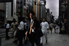
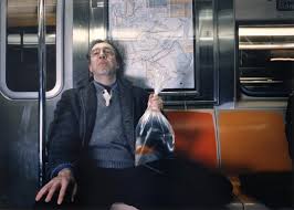
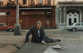
Feelings appear to be impossible to photograph, or unphotographable upon first impressions, objects are an obvious subject. The senses other than sight, such as taste, smell and feel appear at first to be unphotographable.

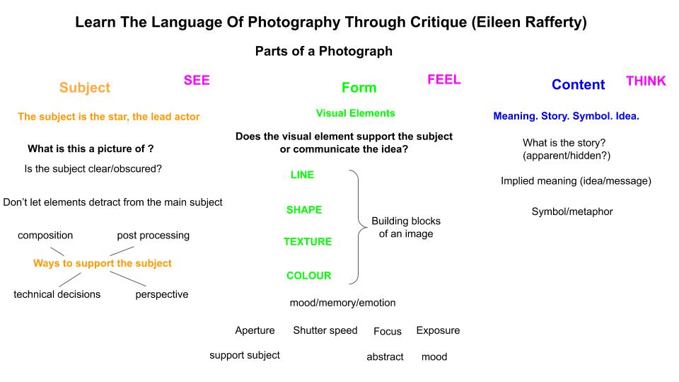
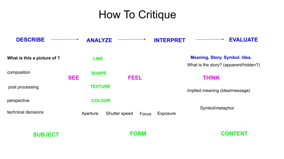
I have done a lot of reading about the language of photography to really understand this concept and in order to make work that communicates what you want it to. You have to think about making your image with the subject, form and content in mind. I have also listened to a lecture by Eileen Rafferty on the Language of Photography on YouTube and this has helped me understand this concept too. The subject needs to be clear and other elements in the frame are used to support it. The visual elements need to help you communicate the concept or idea, the symbols or metaphors need to tell the story.

Think of things that are personal to me and that I currently have a special interest in.

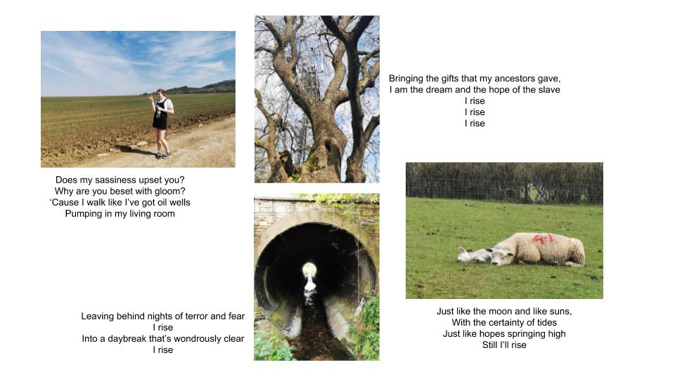
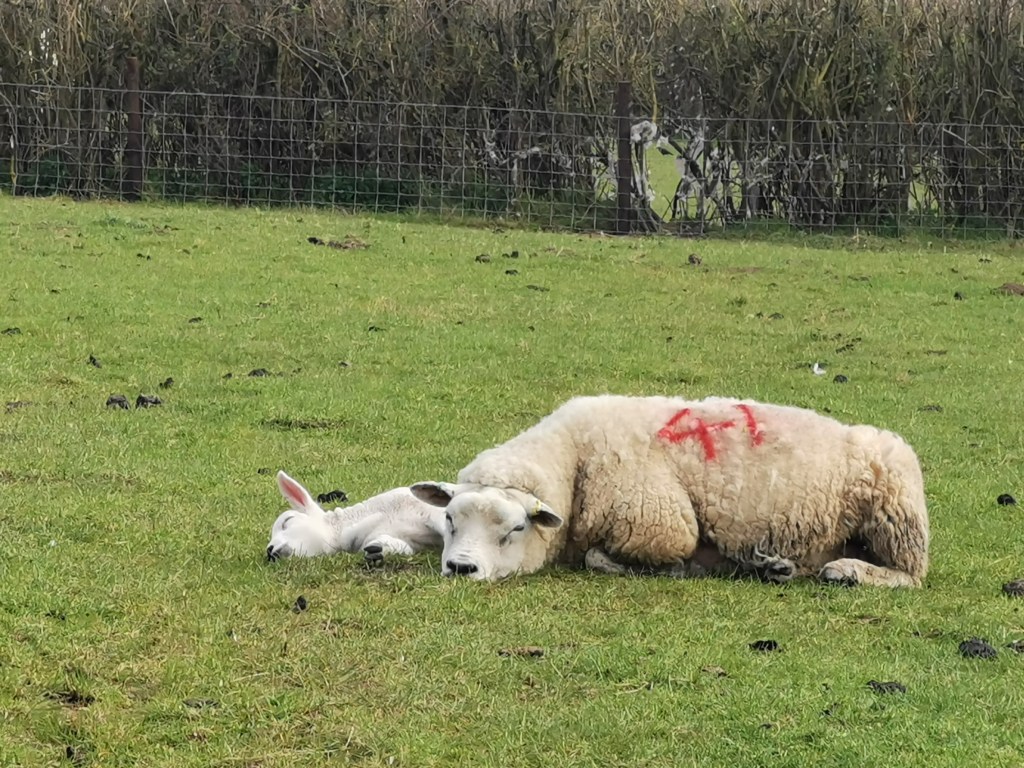
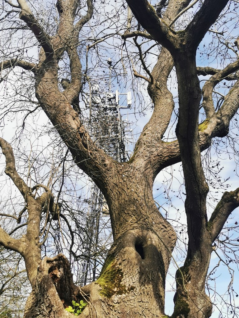
How would I photograph the unseen? The use of symbols and metaphors are useful to portray a feeling or an emotion, for example, light is often seen as a symbol of joy or hope, a single flower could mean isolation, a road the leads to somewhere that is hidden or obscure could mean an uncertain future ahead.

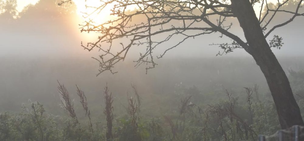
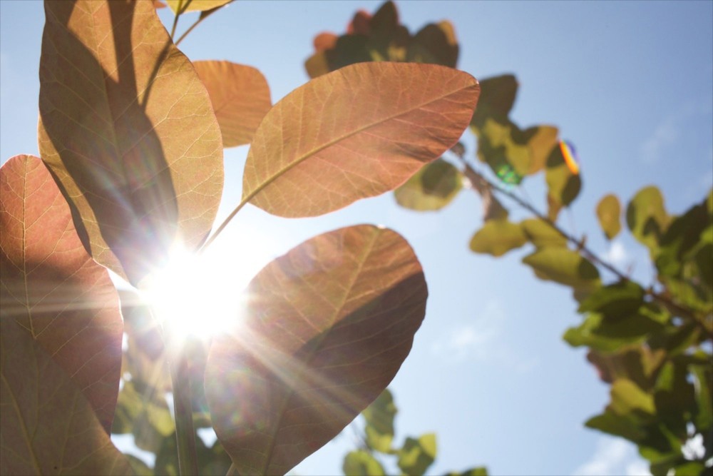
As I go about my daily walks I see these symbols in nature that I could used to communicate my current mood and feelings during this period of lockdown. I have a personal interest in nature and the outdoors and I have taken my inspiration from this and developed it into work that communicates my feelings during this challenging lockdown period.

Research / Inspiration

Bryony Cambell’s work “The Dad Project” inspired me with her photographs of the light and how the sunshine gave her some comfort in difficult times. This is not related at all to the main narrative but is related in an “unspoken” way to her feelings at the time.

The sunshine and blue skies in this image, photographed by Bryony Campbell shows how she found comfort in nature, the “unseen” in this photograph comes through with the use of symbols such as sunlight and blue skies that may signify emotions such as hope or comfort.

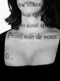
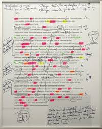
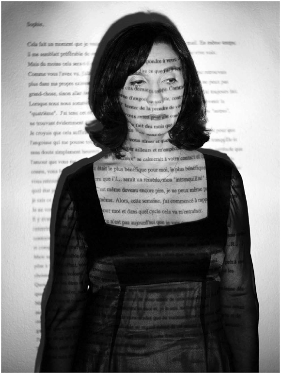
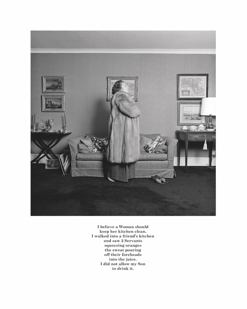
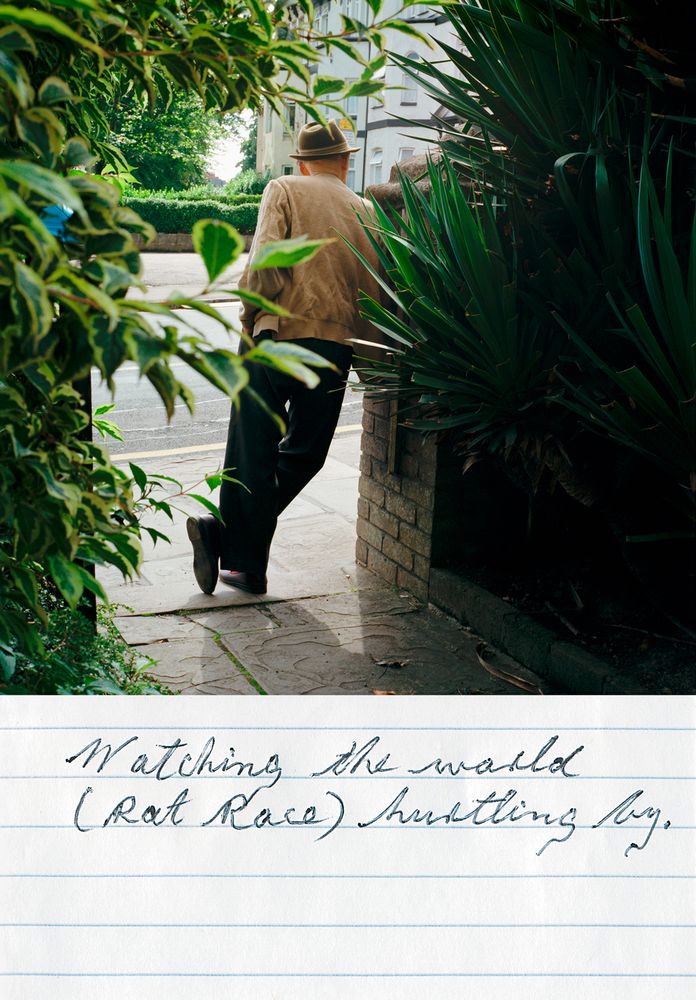
In Graham Clarke’s book called “The Photograph” on page 33 in the chapter entitled “How to read a photograph” he speaks of the photograph always having the capacity to probe and suggest larger conditions, which underlies the notion of an image’s potential “universal” appeal and international language. He suggests there are photographic themes which mitigate against the argument for a photographic language rooted in the culture as the ideology within which the photograph established its meaning. We can then speak of a language of photography, in which every aspect of the photographic space has a potential meaning beyond its literal presence in the picture”. The set of images I plan to create for this assignment will be inspired by this thinking, there will be meanings beyond the literal image, these meanings may be slightly different to each different person viewing the image. I decided to test this theory and asked each member of my family to interpret each image. I have attached the collection of hand written interpretations to each corresponding image to create a set of six diptychs for my assignment.

I also researched the work of Kaylyn Deveney, The Day To Day Life of Alfred Hastings and I was inspired by the way Deveney got the subject to interpret his own photographs in his own handwriting and in his own words, so the subject has more control in the work and it is more of a collaboration. This is what I have done with my work for this assignment and has been the main source of inspiration for my work. I have used lined paper out of a small notebook for each person to write their thoughts and feelings on each image I presented to them.

I am inspired by the work of KayLyn Deveney and her body of work called The Day To Day Life Of Alfred Hastings. I have used the idea of hand writing a description of the image for my work on this assignment.

Ideas

Mind map of ideas for this assessment was created over a number of days where I kept revisiting the brief and thinking about it and jotting down more detail, this, combined with researching theory and other photographers.

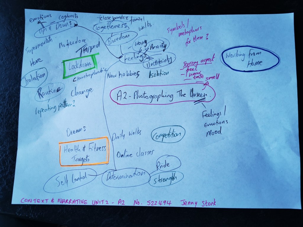
As i created my mind map I came up with three ideas that kept recurring, these were:

Working from home: something that has hugely changed my day to day routine and my life in general

COVID and the lockdown measures: how these have impacted me personally, and those closest to me.

Heath and fitness targets: being someone who has recovered from a critical illness, health is very often what I focus on and think about

Planning

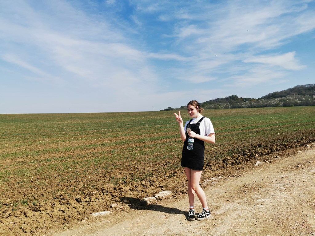
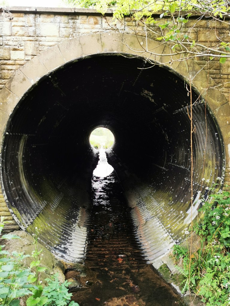
I decided to choose the Lockdown theme and interpret this through images since it has had the biggest impact on my life and has really affected every pat of my life from mental health and wellbeing to relationships and my life goals. It is like every aspect of my life as I knew it has gone and everything is up in the air with the potential for radical change. As I went on my daily exercise walks I began to see images that took on other meanings, such as a path that takes a turn and the end is not visible, this can be interpreted in a way that we are all on a journey during COVID times and the end is very unclear.

Execution

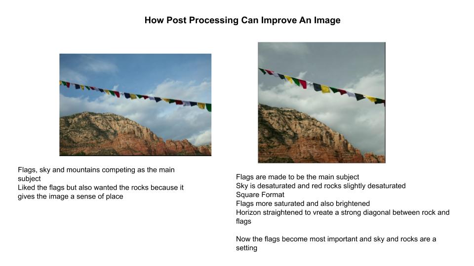
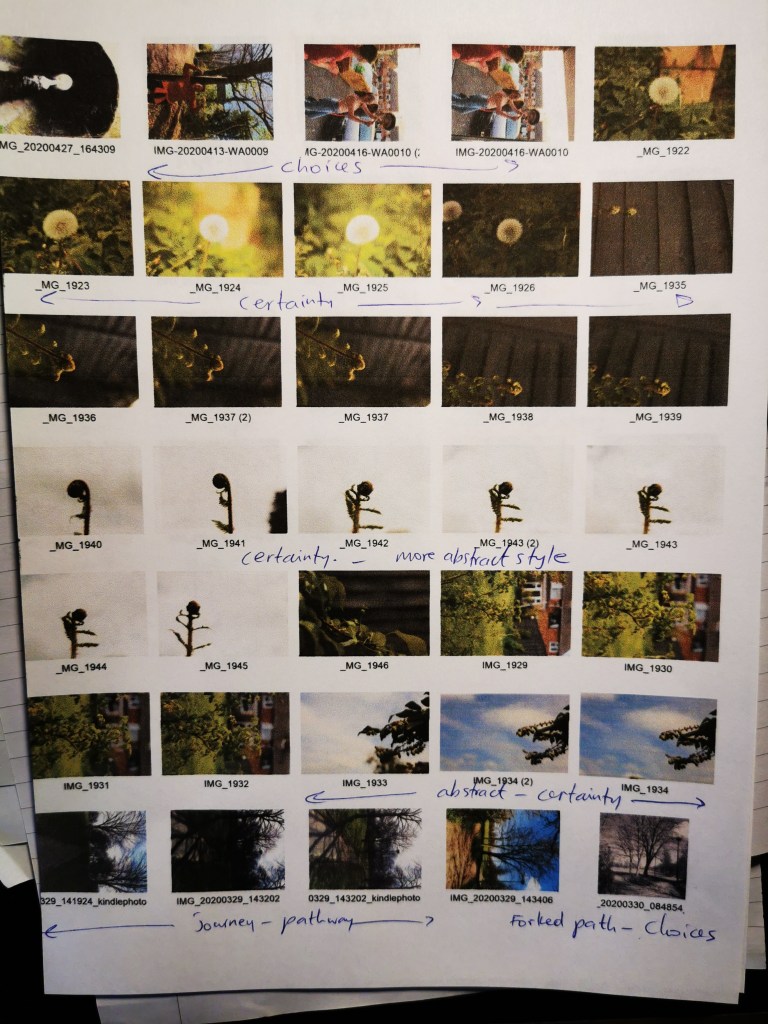
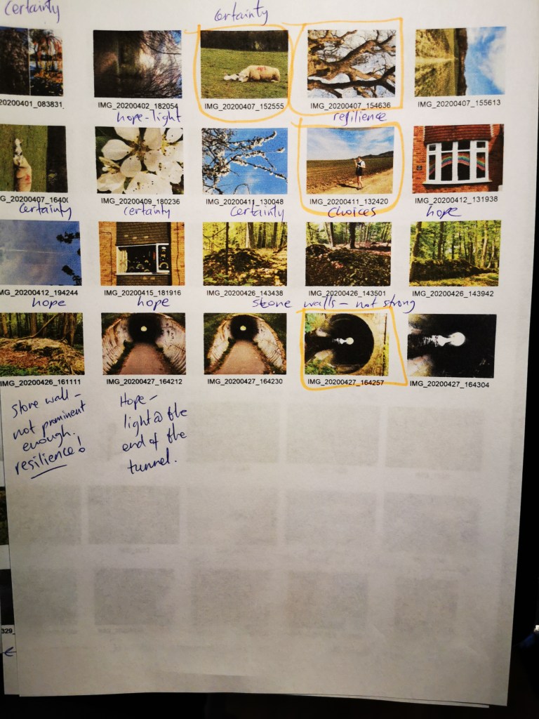
Editing my work I find is one of the most challenging aspects. I took on board my tutors’ feedback from my first assignment and printed out a selection of images I thought may be strong contenders. I laid these out on a table and created a group I thought would look good together, I then noticed the blue sky was very dominant so I discarded these images and went for more muted tones to tie the series together, browns, greys and greens instead. I tried to choose images that had strong shape and lines. I lived with a group for a while then revisited the group and my mind was constantly changing about what I wanted to include. I also had to think that each image has to be different and tell a different story to the others and be able to stand up in it’s own right.

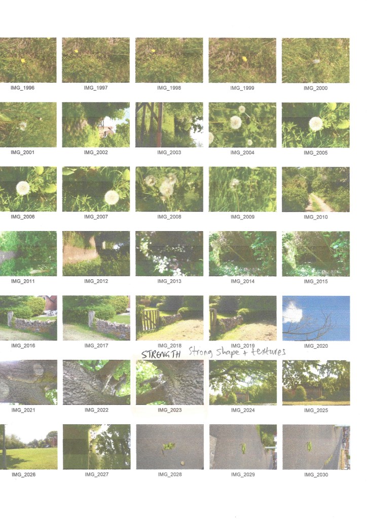
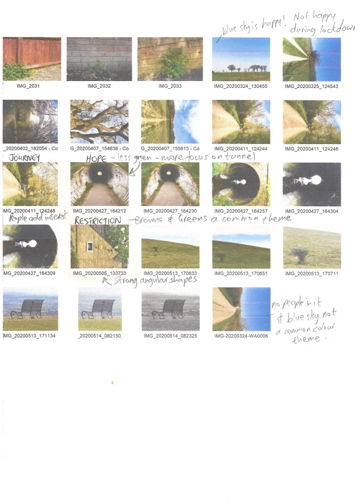
The annotations on my contact sheets are of emotions that come to mind when I see beyond the literal subject matter, I tried to identify strong form and shape and consistent colouring through the chosen images. I find this really difficult and it did help to print off a number of ones I was potentially interested in submitting and just laid them out on a table to see which ones visually connected as a group

Conclusion and Further Work

Once I had created the work and numbered the photographs in my series, those contributing with written words used the numbering I gave to each image. I then thought that the images I chose could have been sequenced better to tell a story. The number allocation was random, when I rework this and depending on feedback from my tutor I will look to apply a narrative thread to this work.

Bibliography

Stork, J., 2020. Learn The Language Of Photography Through Critique (Eileen Rafferty Youtube Lecture). [online] Jenny Stork: Photography 1: Context & Narrative. Available at: <https://contextandnarrativewriting.poetry.blog/2020/05/04/learn-the-language-of-photography-through-critique-eileen-rafferty-youtube-lecture/&gt; [Accessed 5 May 2020].

Stork, J., 2020. Unit 2: Exercise 2: Research Task: Relay. [online] Jenny Stork: Photography 1: Context & Narrative. Available at: <https://contextandnarrativewriting.poetry.blog/2020/04/20/unit-2-exercise-2-research-task-relay/&gt; [Accessed 12 May 2020].

Clarke, G., 1997. The Photograph. 1st ed. Oxford: Osford History of Art, p.33.

Learn The Language Of Photography Through Critique (Eileen Rafferty YouTube Lecture)

There will always be a time when you have to write about your work, either an artists statement or explaining your work etc Or someone asks what do you do

Critiques are subjective, they come from our won history and opinions – but can make it constructive and objective – need to go beyond whether like or dislike an image

Just talk about the photo right in front of you – don’t go off piste

Is there a caption or artist statement? – this can really change the context of the image – any other elements that go along with it that tells a story

Can we get the intention? – only if photographer there or a written statement for context

From a visual design perspective it’s good to create a hierarchy in your image, the main subject is the star of the show, then other layers or objects in the background or foreground – the supporting cast – they are there to support the main subject. If the viewer dosent know what the subject is then there is something wrong with it and needs changing.

How many times to do you ask when you are shooting “what is my subject?” I need to shoot so the subject is the main star of the show – get specific about why you are making the image then you can make technical/. visual decisions to highlight what the subject is. Everything in the frame should support the subject – whatever detracts should be removed or minimised

The key is to be discerning once you have taken the images to decide which ones to show – based on a set of criteria – there is no right or wrong but these are guidelines

Post processing – support the subject – cropping, desaturating, lighten dark areas.

Blue skies and green grass are very alluring, so if these aren’t your main subject then often de saturate in post processing so they take more of a supporting role to the main subject in the image

Perspective – get down on his level and make him the main subject ( dog photo)

Catch light in the eyes when shooting living figures

Take film and process it in the wrong colours – this is an old fashioned way of adding filters and post processing – the human element is at the edge of the frame which creates tension and movement – also then, it’s not the main subject if there is something else in the image that is

Process with a bluish/greenish cast – this portrays emptiness and changes the mood and feel of the photo – critiques are subjective so not eveyone may get this

Una Barthes shoots alot of images that are totally out of focus – context matters more with this type of image – if you are going to break a technical rule – do it properly so It dosent look like an error. If out of focus can still talk about shape and colour

Irving Penn was the opposite and got every detail close up

There is a rule that you shouldnt put the horizon in the middle of the photo – should be in the upper or lower third to create more visual interest. If the horizon is off kilter, really make it this way so it looks intentional

Apple about to drop – growth in a desolate area – last one on the tree still hanging on – feel of isolation, hanging on , security

The subject as an apple is not the most important part of the image to talk about but the symbol or metaphor is what is important here

In order to critique an image (or for any artwork), the academic approach to this Is :

In photography, probably more than any other artistic discipline we drop the ball the most on presentation. We need to think more about the final outcome, printed? Digital ebook, photobook? This matters alot as to how the viewer experiences, interprets, thinks about your work.

Is what you are seeing and feeling helping to support the idea, story, message? (THINK)

If you are seeing and feeling something completely different to what the photographer intended – then you need to think about what changes can you make to bring us closer to what you are trying to communicate?

Photos in a series, diptychs or triptychs:

Need to be talked about together, colours play off eachother, textures prominent, natural elements (water and wood) – both about flow (nature) one and many, quality of light the same across all (temperature, direction, quality, hard/soft)

When you eliminate colour, line, shape and texture need to be important and prominent.

Need to talk about what hits you first and how it makes you feel – what else in the image may be contributing or causing that reaction?

Technique – does it add to it or get in the way? HDR and soft focus

The collage technique used by David Hockney is something that is prominent and needs to be talked about

Sometimes the filter is too strong and can obscure the form or the content

Symbols – loaded with symbolism – face of Putin

Text is very prominent – when it is on an image we read it immediately – very powerful visually – it always has to be addressed and is really meant to communicate something

Jim Goldberg made work where the subject in the image wrote captions about their own image rather than the photographer doing this.

With conceptual images it is more important to have a context with these

It is still possible to talk about abstract photos – form and colour are most obvious – talk about line, shape, colour, texture and technical choices made to produce the image

In a series, shot in the same location or different? Visually connected by colour, texture, scale – think about why these have been put together?

or put together based on a concept – a mood or idea is the same

Could put some context to the series through an artist statement, titles, captions

Youtube video can be found here

Unit 2: Exercise 3: Poetry Interpretation

Choose a poem that resonates with you then interpret it through photographs.
Don’t attempt to describe the poem but instead give a sense of the feeling of the
poem and the essence it exudes. Start by reading the poem a few times (perhaps
aloud) and making a note of the feelings and ideas it promotes, how you respond
to it, what it means to you and the mental images it raises in your mind.
Next, think about how you’re going to interpret this visually and note down your
ideas in your learning log.
You may choose to develop this idea into creating a short series of images
reflecting your personal response to the poem (or another poem). Write some
reflective notes about how you would move the above exercise on. The number
of pictures you choose to produce for the exercises and assignments in this
course, including this one, is up to you.
Try to keep in mind the following tips for knowing when you have done
enough/not done enough:

  1. Are the images repeating themselves? Are there three versions of the
    same picture for example? Can you take two out?
  2. Does each image give a different point of view or emphasise a point you
    want to make?
  3. Do the images sit well together visually?
  4. Have you given the viewer enough information? Would another picture
    help?

Poem Choice

The poem I have chosen was written by Maya Angelou. The first time I heard this poem was when it accompanied an opening video clip to the Wimbledon woman’s singles final in 2017 and the focus was on Serena Williams and as a black woman how she has overcome the odds to achieve sporting greatness and achievement. The visual analogy really touched me, so the imagery with the text must have worked well for it to have resonated.

You may write me down in history
With your bitter, twisted lies,
You may tread me in the very dirt
But still, like dust, I’ll rise.

Does my sassiness upset you?
Why are you beset with gloom?
‘Cause I walk like I’ve got oil wells
Pumping in my living room.

Just like moons and like suns,
With the certainty of tides,
Just like hopes springing high,
Still I’ll rise.

Did you want to see me broken?
Bowed head and lowered eyes?
Shoulders falling down like teardrops.
Weakened by my soulful cries.

Does my haughtiness offend you?
Don’t you take it awful hard
‘Cause I laugh like I’ve got gold mines
Diggin’ in my own back yard.

You may shoot me with your words,
You may cut me with your eyes,
You may kill me with your hatefulness,
But still, like air, I’ll rise.

Does my sexiness upset you?
Does it come as a surprise
That I dance like I’ve got diamonds
At the meeting of my thighs?

Out of the huts of history’s shame
I rise
Up from a past that’s rooted in pain
I rise
I’m a black ocean, leaping and wide,
Welling and swelling I bear in the tide.
Leaving behind nights of terror and fear
I rise
Into a daybreak that’s wondrously clear
I rise
Bringing the gifts that my ancestors gave,
I am the dream and the hope of the slave.
I rise
I rise
I rise.

Notes of Feelings as I read the poem aloud

Hope and resilience sums up my feelings on the whole.

Motivated to never give up. A feeling of strength

I can relate to this, a feeling of familiarity that resonates at this time of Covid 19 lockdown restrictions placed on our freedom of movement

“Oil wells pumping in my living room, gold mines in my back yard” signifies wealth that is beyond material objects, these could be instead health, happiness, love, peace and respect. These statements in the poem I also interpret as self pride and self esteem, these descriptions of wealth, although described as in the home and yard can also be synonymous with things that are within the boundaries of the individual that no one else has the ability to alter of affect if the individual chooses this.

Ideas About How am I going to interpret this visually?

Image 1 The Certainty of Nature

Maya Angelou talks of the certainty of the sun, moon and tides, which is the certainty of nature’s cycles. I observe the certainty of nature on my daily walks, blossoming trees where petals will certainly fall, muddy paths that certainly dry as the warm weather arrives. The certainty of nature in my garden where rose bushes come back to life and bloom every year, where grass grows more vigorously in the spring, where birds nest every year. This certainty in a time of unprecedented uncertainty brings an enormous sense of well being and stability.

Image 2 & 3 We all have choices at a time of struggle ( Fork in a path and also joyful positive attitude of people in my family)

“Do you want to see me broken? Bowed head and lowered eyes?” The poet asks the question but knowing that is exactly what they want to see and she defys this with a choice of positive attitude. We have a choice to be positive or negative about a situation beyond our control. We are in control of what attitude we choose. In the face of adversity we can choose to do what the poet has done, to be sexy and sassy and walk like you have all the wealth in the world.

Image 4 Hope – where there is hope there is a reason to continue

Light at the end of a tunnel or light shining through the trees – the rainbows drawn in windows are a symbol of hope.

Image 5 ( Opposites : Good and Bad, Old and New )

The poem is about good and evil and different social groups and opposites in attitudes and behaviours. An image that has dichotomy or opposites in a juxtaposition would be an interesting interpretation to the overarching theme of the poem

Image 6 (Resilience – strong, protective shield, gate, wall that stands the test of time)

This could also be ruins that are still standing or even a small plant growing through a crack in the pavement or through a brick wall or a very old three that has stood the test of time

Contact Sheets

Image Selection

I have annotated the contact sheet to show the different images that relate to the categories or main themes of the poem : certainty, choices, hope, resilience

With the choices category I have chosen images of people with a joyous attitude, showing that we can choose our attitude in any situation.

Final Outcome

I have taken text from the poem that resonates with each image.

Top Left Image : Does my sassiness upset you? This image shows “choices” where a positive attitude has been chosen through the lockdown period, making the most of what we have, our daily exercise walks and beautiful surroundings to walk in are positives to choose to embrace. The blue sky and sunlight give a positive upbeat feel to the image and the green ties in with the other images, the outdoors theme runs through each image to tie them together. In the poem, for Maya Angelou who wrote the poem, she chose a positive attitude and self pride during times of racism and oppression, and this is what this verse describes.

Top Right Image : Bringing the gifts that my ancestors gave I chose a very old, large tall tree to describe “resilience” and strength above all odds. There is a smaller, less significant man made steel mast in the background that signifies the oppressors and how much weaker and of a temporary nature this represents. The text “I rise, I rise, I rise” at the end of the verse signifies the tree rising into the sky as it continues to grow. This image I feel represents the situation we find ourselves in, the small steel structure represents COVID 19 which is smaller, and of a temporary nature compared to the tree which represents resilience and strength.

The brown shape of the tree that dominates the image ties in with the ground in the first image (top left) and also the other two images where this brown tone exists in the image of the sheep with bush in the background and the brown colour of the entrance of the tunnel.

Bottom Left Image: Into a Daybreak That’s Wondrously Clear The light at the end of the tunnel in this image signifies “hope” This image has the brown and green tones that ties it visually with the others in the series. This is the disruptor image in the series since it has a large amount of concrete that dominates the image which is different to the others, it also is more abstract than the others in the set. The outdoor element to this image ties it to the others too. The Poem signifies light at daybreak which also signifies hope, the line “leaving behind nights of terror and fear” relates to someone who walks through this dark tunnel and then comes out the other side into the light. Covid 19 lockdown and the situation the virus has created is synonymous with dark unpleasant tunnel but at the end there is normality and light again.

Bottom Right Image: “With the certainty of the tides” – this image is about certainty, every year baby sheep are born and the cycle of nature continues despite the turmoil that is happening in the world – the present turmoil is presently Covid 19 but Maya Angelou’s poem relates to the racism and oppression she endured – despite this she continued her routines despite what has happening.

This image visually connects with the top left image where there are lines running through them, this image has the line where the grass and the bush meet, the top left has a horizon line and a line on the dirt road that are distinctive and visually connect the two. The green and brown tones also connect the images

Does my sassiness upset you?
Why are you beset with gloom?
‘Cause I walk like I’ve got oil wells
Pumping in my living room.
Just like moons and like suns,
With the certainty of tides,
Just like hopes springing high,
Still I’ll rise.
Leaving behind nights of terror and fear
I rise
Into a daybreak that’s wondrously clear
I rise
Bringing the gifts that my ancestors gave,
I am the dream and the hope of the slave.
I rise
I rise
I rise.

Unit 2: Exercise 2: Research Task: Relay


Examples of relay in contemporary photographic practice include Sophie Calle’s
Take Care of Yourself​ and Sophy Rickett’s ​Objects in the Field​ (see interview in the
Appendix to this course guide) where clashes of understanding or interpretation
work together to create a perhaps incomplete but nonetheless enriching
dialogue between artist and viewer.
Look these pieces up online. Investigate the rationale behind the pieces and see
if you can find any critical responses to them. Write down your own responses in
your learning log.
● How do these two pieces of work reflect postmodern approaches to
narrative?

Post modern approaches to narrative mean that the traditional structure of a story that has a beginning, middle and end is challenged. The notion of authorship control too.

Examples of post modern approaches are

Including fragments of other texts – ambiguous, open ended plots, unresolved endings, reduced, disruptive language.

This approach allows the reader to put themselves into the story, there is a call to the reader to become less passive, for endless possibilities of interpretation for a more enriching experience.

Sophie Calle’s rationale is to use a negative life event and turn it into a positive one through artistic expression using the postmodern narrative approach. The text that is the break up email she received from her boyfriend becomes the work of art, where one of the 109 women who have analysed the email have highlighted certain parts of it to point out grammar errors for example.

Parts of the email text are copied and used on photographic portraits, this is a good example of using a most modern narrative approach (see images below as an example of this)

There is no conclusion to the work, the narrative is open ended for the viewer to interpret. The answers are less important than the forms of engagement of the 109 women from different professions who were asked to review and critique the email message, invited to construct meaning. These forms of engagement are a key creative part of the final body of work since each one approached the critique in their own unique way, depending on their line of work.

Another way to incorporate text into an image-based project is to include
interviews or audio.
The New York Times has a simple but effective project online called One in 8
Million about the inhabitants of New York. It includes images of people from
different walks of life and professions with audio clips overlaid to give a voice to
the subject. It is a clever way of celebrating the richness and diversity of a city
with such cultural and social variety. Some photographers use interviews and
diaries to incorporate text with their images.
You can research the following examples by searching on the weareoca
website:

Kaylyn Deveney – ​The Day-to-Day Life of Alfred Hastings

Who is KayLynn Deveney? From USA, she moved to the south of Wales to study documentary photography and earned a masters and PHD in University of Wales Newport. The Day-To-Day life of Alfred Hastings was her first photography book produced in 2007. In 2008 it was nominated by several institutions across the world for “best photobook”

Deveney’s work focusses on addressing the myths of domesticity. She lived near an elderly gentleman called Alfred Hastings and became friends with him and asked if she could work with him to make this work. This module has been focused on the use of text that works alongside an image and how this adds context and meaning and enriches the work. The text in this work has been added by the subject who is not an artist, Alfred Hastings. This work is in collaboration with him and gives him a voice about the way he sees himself and an important visual contribution to the work. The fact that the text is his own handwriting makes it feel to me as more authentic and emotionally draws me in to this work. Alfred Hasting’s description of the photographs gives him a voice and a real sense of his own home surroundings and routines. The text is integral to the work and without it the work would not be as good.

The lined paper that he has written his notes on to describe each image gives an informal diaristic feel to the work, again, making feel more authentic.

Each image shows a very different aspect of his life, for me this kept my interest as I Iooked and read through the work. The images are also different in composition and colours used, but the wording in the same handwriting, by the same person, on the same paper (each containing the same number of lines) is what creates a cohesiveness in the series.

Karen Knorr – ​Gentlemen (1981 to 1983)

Knorr was born in Germany to American parents, grew up in San Juan, Puerto Rico, studied in Paris, and moved to London in the summer of 1976. She wanted to understand the country she had chosen to live in and reflect on her position as a white upper-middle- class woman in it. “I was trying to figure out who I was and where I stood,” she says. The photographer moved into her parents’ Belgravia maisonette for six months, situating her at the centre of an unfamiliar world inhabited by the British elite.

A series of 26 black and white photographs taken in gentlemen’s clubs in St James in central London with short passages accompanying each image. They were images of gentleman’s clubs in the 1980s and they revealed hidden spaces and what went on in those spaces. The passages are fictitious and written by Knorr. They are based on contemporary news events and parliamentary speeches published in Hansard concerning race, the role of women, and the Falklands War. The photos are staged with actors, employees or friends, so modern contemporary people and text are combined with historical settings of the gentlemans club. It took the artist a year to take the images and make the work.

Karen Knorr – Gentleman


Karen Knorr – Gentleman

Bibliography

Haber, J., 2020. Haber’s Art Reviews: Sophie Calle. [online] Haberarts.com. Available at: <https://www.haberarts.com/scalle.htm&gt; [Accessed 21 April 2020].

KayLynn Deveney Photographer. 2020. The Day To Day Life Of Albert Hastings — Kaylynn Deveney Photographer. [online] Available at: <https://kaylynndeveney.com/the-day-to-day-life-of-albert-hastings&gt; [Accessed 25 April 2020].

Deveney, K., 2020. The Day-To-Day Life Of Albert Hastings. [online] Ulster University. Available at: <https://pure.ulster.ac.uk/en/publications/the-day-to-day-life-of-albert-hastings-3&gt; [Accessed 27 April 2020].

British Journal of Photography. 2020. Karen Knorr: Gentlemen. [online] Available at: <https://www.bjp-online.com/2020/02/karen-knorr-gentlemen/&gt; [Accessed 27 April 2020].

Unit 2 Ex. 2 : Newspaper Analysis

Cut out some pictures from a newspaper and write your own captions. 

1. How do the words you put next to the image contextualise/re-contextualise it?

2. How many meanings can you give to the same picture? 

Try the same exercise for both anchoring and relaying. Blog about it.

Anchoring Text for an image found in a newspaper
Relay text for an image found in a newspaper

Anchoring of words can drastically change the meaning of images as I showed in the first image in this blog where I created several different anchoring captions.

The lack of green space, early in the day when it’s quiet, lack of cleaning resource, Big Ben refurbishment and also the quality of maintenance in the capital are just a few ways the first image can be interpreted with the use of anchoring text. It is easy to see how the same image can be used in different contexts and can have several different meanings. Photographs are often used for political and environmental messages nowadays.

Relay words I found far more difficult to come up with since this involves more thought and deeper creative thinking than that for ways to anchor the image with text. I think relay words, if placed on or near the image in an eye catching font or a handwriting is far more powerful and impactful than anchoring and it could potentially influence political change more than the anchoring text used by newspapers to put across their particular political views, but the newspapers need to appear to be neutral so this would be frowned upon by the audience and alienate certain groups.

Relay text is a method of expression I plan to think about using in my own words. In future assignments I need to think more about the text that accompanies each image and what that image does to the meaning of the work.

Photobooks : J. Colberg

My tutor suggested further reading around editing and sequencing of images, this is an area I need practice and to develop an effective techniqe

Some notes I took from the book so far :

The book’s concept is very important

Elements of the story can be introduced at first without being related – the viewer trusts the author that the story will be revealed later on in the book and they can make sense of the photos – eventually things will start to relate to what has been seen before

Use double sided tape so can attach and remove images either from a wall or a dummy book

Dont put too many different layouts and image sizes for different spreads

Start edit and sequence and simple layout with a basic dummy – and then when happy refine other bits.

Simple decisions and ideas lead to a complex and truly immersive book – Mariela Sancan (Moises) – the book is unfolded to discover portraits of an old man in his 70’s – her dad died from suicide and this searching experience in the book reflects her pain.

Design :

  • How a page works
  • How to pace information
  • How text can support an image and vice versa

Design is not what the photographer wants but what the work in question demands

Most photographers are not trained designers- approaching a professional designer early on in the process is a good idea – find graphic and physical manifestation of your photographic ideas

Tien Van Der Heijden – Dutch Designer

2 books on either side of the design spectrum : Walker Evans – American Photographs and Interrogations, Donald Weber

A designer that knows how to read the language of photography can have input on the editing too

Design helps telling the story in a physical form that adds to the intention of the story

Limited budget will force you to enhance the essentials and the basic elements – often making the work stronger as a result

The Dutch Photobook – Aperture 2012

The photobook, A History – Martin Parr

Kuipers 10 golden rules pdf

Physical aspects : the colour cast across a book especially if its a budget print

Choice of paper, type of printing and type of binding will all affect the outcome

Perfect Binding – a common cost effective binding, restricts opening – avoid detail close to the middle – there is no perfect binding option and with age a physical object will deteriorate no matter what the quality of binding used

Richard Benson describes the difference between a photobook and an exhibition :

“How naive are we to think that we can see it all at first glance when hung on a wall or on a computer monitor. The book solves this problem, we can look long and hard without distraction and return to it again and again. Photographs can become like old friends, and like the best of them they can reveal themselves endlessly as we come to know them better”

In my own work

I need to start to print out my work and get the editing and sequencing part of my work better – put images on the walls and live with them

Need to find a partner that can critically evaluate my work and I can work with going forward

Become familiar with a number of photo books to inform your own work – try to understand whether they work, how they work – how their different elements come together and how design helps to support the work

Bibliography

http://jmcolberg.com/weblog/extended/archives/how_to_make_a_photobook/

http://harveybenge.blogspot.com/2012/03/photobook-some-thoughts-on-editing-and.html

http://jmcolberg.com/weblog/2012/04/review_the_dutch_photobook_by_frits_gierstberg_and_rik_suermondt_eds/

A1: 2 Sides Of The Story: Reworked

Content :

Homelessness on the streets of the UK, how different people in society behave when confronted by a homeless person as they walk past. Also, images produced through the eyes of someone living on the street.

Form:

Strategy of POV shots – landscape / portrait dichotomy to demonstrate “two sides of the story”

The photographs are taken from the view point of a passer by on the street (landscape). The second set of images is from a the perspective of the homeless person (portrait). The images were taken from a lower perspective in an attempt to reflect their view of the world from a sitting or lying position. The images differ in colours, in the prefix name on the image entitled “The Public View” these are more colourful and more subjects are included in the image, a more positive, ordinary feel to these images. The set “The Other Side” shows more concrete pavement and people from a completely different point of view, hardly every seeing people’s faces as they look away or avoid eye contact. (See link in Bibliography for a full explanation of how the shots were taken)

Context : Documentary – ways of seeing – giving back power to the subject (photovoice) – challenging previously help assumptions of the genre

My work was inspired by the work of Julian Germain called “No Mundo Maravilhoso Do Futebol” and Anthony Luvera’s “Taking Place” exhibition that incorporates his work from a project called “Frequently Asked Questions”. The power is put in the hands of the subject as to the outcome. The subjects have produced the images that depict “the other side of the story” (See links in bibliography for more information on the works of Julian Germain and Anthony Luvera).

Images

The Public View JS001 The common situation when a passer by encounters a homeless person is to either ignore them or stare
The Other Side JS002 A common site at a sitting position on the street for a homeless person
The Public View JS003
High Street JS004
The Public View JS005 a common issue today is the mobile phone, people are no longer present and don’t notice the plight of the homeless at all
The Public View JS006 This man was opening a bottle of wine at 10am. A common site by the public is alcohol and drug misuse and therefore can be unfairly judged or looked down upon
The Other Side JS007 Grey concrete is the immediate environment for a homeless person, cold, hard and uncomfortable, a good analogy for the life they have to endure. There is also the view of life “on the other side” where a family can be seen entering a fast food restaurant.

Bibliography

Stork, J., 2020. A1: Two Sides Of The Story, Image Capture Technique. [online] Jenny Stork: Photography 1: Context & Narrative. Available at: <https://contextandnarrativewriting.poetry.blog/2020/03/30/a1-two-sides-of-the-story-image-capture-technique/&gt; [Accessed 30 March 2020].

Juliangermain.com. 2020. Julian Germain “No Mundo Maravilhoso Do Futebol”. [online] Available at: <http://www.juliangermain.com/projects/nomundo16.php&gt; [Accessed 1 April 2020].

Anthony Luvera. 2020. Anthony Luvera: Taking Place – Anthony Luvera. [online] Available at: <http://www.luvera.com/taking-place/&gt; [Accessed 1 April 2020].

A1 Research : Two Sides Of The Story : Lorca diCorcia

Feedback from my tutor about assignment 1 suggested further reading into the work of diCorcia- his method was to set up a camera a distance from where he is located and use a remote control to operate it, so people are photographed without their knowledge in a completely natural state

The main points I noted from watching the youtube video were :

The method of making work was to :

  1. Set up the lighting rig and the scene ( the dramatic elements)
  2. Use a polariod with actors and construct the scene in advance and test the result
  3. Let the subject walk into the frame – these can be either known or unknown people

I classify people into different archetypes, most of the time they are not like that but I manipulate them to be like that.

To photograph people in the street effectively you have to sensitise yourself to the subtle clues

A photo captures a moment of truth and diCorcia operates to disrupt this completely

Often he didn’t know his subjects because of his methodology

The interior of a person is very different to the exterior, “life is a performance”

Because of the physical distance from which the images are taken, this gives the viewer alot of authority to interpret and experience the images in the way they want to.

The eye level cinematic approach to making his work is what draws the viewer in and makes them more real and engaging

The idea you can manipulate people and the world in this way is an interesting and compelling motivation for me.

For my own work: this was a very quick diagnostic assignment, diCorcia took over 3000 images to make a series of 17 – so lots more work and photos needed to be able to create something I am happy with

Setting up with a tripod, perhaps at a cinema style level which is square and a level aspect would give more impact – use a remote for taking the shots

Think about lighting, this has a huge impact on the feel of the image

Bibliography

Lorca diCorcia, P. (2014). The Hepworth Wakefield: Photographs 1975 – 2012 .
[online] Available at: https://www.youtube.com/watch?v=So_FK4qnz5Q [Accessed 21
March. 2020].

A1: Two Sides Of The Story, Image Capture Technique

Street photography has become more difficult over the years in the UK with an increasing amount of suspicion around the intent when a photographer is seen on the streets with a large, obtrusive camera. The duty of care over children and the use of their images on the internet has also become an issue, however, a public space is a space where it is legal to take photographs in the UK, for now anyway.

My approach to making this work was to simply stand at a distance from my subject and photograph the buildings next to them so the camera was not facing them directly. After a while my subject became used to me and thought I was not photographing them. I would move my camera occasionally towards them and take the shots quickly as people entered the frame, then move it back towards some buildings again. This took about twenty minutes and some patience. I wanted to capture the same scene but different reactions from people walking by, hence what appears to be a similar photo, but is in fact not because of the interactions that are going on within the frame between those on the margins of society and those who are not.

Ideally I would have liked to introduce myself to the subjects and asked their permission, but in this instance I felt the purpose of my shots were totally in my interest and not theirs. Reflecting on the situation, the activity could have been mutually beneficial where I could pay them cash perhaps? There is still no guarantee that this approach would have been received well.

I am interested in social change for the better for all people and have a particular empathy for the homeless, I admire artists such as Anthony Luvera and Lee Jeffries who spent time with the people and treated them with dignity and respect and built up mutual trust before they embarked on a collaborative photography project. The projects also generated income for better support for them and also changed the way councils are obligated to support the homeless in the UK. This, ideally is how I would want to approach an activity such as this, but since it was just for an assignment at this time I chose the anonymous route this time.

Feedback from my tutor on this assignment was to link this blog to my assignment in its bibliography so there is a better understanding by the reader about how I made the work.

For my own work: this was a very quick diagnostic assignment, diCorcia took over 3000 images to make a series of 17 – so lots more work and photos needed to be able to create something I am happy with

Setting up with a tripod, perhaps at a cinema style level which is square and a level aspect would give more impact – use a remote for taking the shots

Think about lighting, this has a huge impact on the feel of the image

Understand fully the different street photography techniques and with practice and experience develop a style and approach that reflects my values and interests, currently I prefer the collaborative way in that the process has a positive impact on everyone involved, however, the practicalities of this approach at present inhibit me.

Additional feedback is to research the work of :

Street Photography Alternatives: Placing the camera (on a tripod) and allowing people to
walk into the frame (might help less conspicuous when making the ’objective’ images/
Passer by
• David Campany. 2020. ‘Anonymous And Incognito: Walker Evans’ – David Campany.[online] Available at: https://davidcampany.com/anonymous-and-incognito-walker-
evans [Accessed 23 March 2020].

• Lorca diCorcia, P. (2014). The Hepworth Wakefield: Photographs 1975 – 2012 .
[online] Available at: https://www.youtube.com/watch?v=So_FK4qnz5Q [Accessed 21
March. 2020].

Bibliography

HOMER, N., 2020. Anthony Luvera – Interview: ‘Photography Is A Way Of Telling Stories About The World’. [online] Studio International – Visual Arts, Design and Architecture. Available at: <https://www.studiointernational.com/index.php/anthony-luvera-interview-photography-for-whom-telling-stories-about-the-world&gt; [Accessed 29 March 2020].

Barrett (1986) Photographs & Contexts Art Education, Vol. 39, No. 4. (Jul., 1986), pp. 33-36

Below are key notes from recommended reading from my tutor after my A1 submission.

Photographs are segments excised from large real-world situations

Photographs are instants frozen from a real-world temporal flow

We ought to replace a pictured segment back into the unpictured world – we need to do this to understand what a photographer has done and what the picture is about

Understanding the difference between a picture and the reality of where the picture was made is essential to understand and appreciate the photograph

Understanding the difference between a picture and the reality from which it was made is essential to understand and appreciate the photograph

Internal context : that which is given in the photograph – how form and subject combine to express – this is an obvious starting point for any photo – methodologies for investigating the apparent in a photo need to be considered – some photographs only need internal context to understand their meaning, a general knowledge of culture and careful attention to what is being shown is enough. Depth of field, ISO, exposure and other technical aspects are also used to express meaning and need to be considered too.

Original context : refers to what is broadly physically and psychologically present at the time the photographer made the image – the photographer’s intent, the intellectual, sytlistic and imagistic thoughts of the photographer. Knowledge about circumstances surrounding the photograph makes it more than what is obviously displayed and therefore more meaningful.

External Context: refers to the photographers presentational environments – how and where it is being presented, how other interpreters have understood it and where it is placed in the history of art. The meaning of any photo is highly dependent on the context in which it is placed.

Learning how critics and historians think and work and sometimes adopting this approach may benefit students

Students should examine how presentational environments influence the meaning and understanding of a photo

Photographer, editor or curator who has put text next to a photograph? Students should seek to know this to understand the meaning of the image

An editor or curator are forms of interpretation only and are therefore not part of the photo

Take advantage of alternative viewpoints when studying a photo

Simple name, date, title, medium, size and source of the reproduction are clues to the meaning

An untitled photograph could be considered a work of art because there is no title

What was going on in the art world and social and historically when the photo was made?

The photographer can alter the meaning and emotional effect of a photograph by surrounding it with other photographs

Curators arrange photographs for new theoretical insights and greater emotional impact.

Taken from Gillian Rose : Visual Methodologies